Impeccable: a design vocabulary for agents is mostly a linter with opinions
Paul Bakaus's design skill for coding agents sells itself as the missing design vocabulary. Opened up, it is about 60,000 words of instructions and a 212,000-line Rust linter, and the linter is where most of the new work is.
How this page is set
- Reading face
- Newsreader, 19px, for the column only
- Display face
- Hanken Grotesk, the site’s own
- Measure
- 63 to 73 characters a line (
mode-read.md:15) - Scale
- 14, 16, 19, 22, 26, 40, 44 and 96px; four times the space above a heading as below (
craft-floor.md:11) - Colour
- Ink on white, both tinted blue; yellow marks findings and nothing else (
colorize.md:42) - Refused
- Eyebrows, side stripes, nested cards, gradient text (
craft-floor.md:25-35)
Why read this
Essentialtop 10%Reads Impeccable's skill text and Rust detector, sorts its 65 rules by what they measure, and runs its own passes and detector on this page.
- Analysis found nowhere else
- Runs on a laptop CPU
- Widely used
Developer tools & infraApache-2.0Practitioner tool
How this was scored
- Is it new?
- 2 of 3: A real new idea, method or capability
- Can I trust it?
- 2 of 3: Measures key facts from files, code or configs
- Can I run it?
- 3 of 3: Open, permissive, runs on reader hardware with instructions
- Will I understand it?
- 2 of 3: Mechanism from first principles with figures
- Can I act on it?
- 2 of 3: A concrete recipe, numbers or comparison
- Will it last?
- 2 of 3: A reference for a year or more
- Does it affect many?
- 2 of 3: A widely used model, tool or lab release
- Only here?
- 3 of 3: The only place this analysis exists
Score 78 of 100, ranked 28 of 454 rated articles. Each question is answered 0–3 by hand, and a 3 is rare. How articles are scored
Impeccable's home page has one line of pitch: "The missing design vocabulary for agents. Turn AI slop into interfaces you're proud to ship." Under it is a card. You can drag a slider across it and watch a beige release-planning card with a purple left stripe become a plain white one. The site's star badge reads 76k. I wanted to know what a "design vocabulary" for an agent actually is when you open the box. Is it a list of things not to do, a set of principles, or a tool that measures something?
I expected a long prompt, like most skills I have read here: figures4papers is a house style written as a SKILL.md, and the one-shot launch video skills are instructions handed to a framework. What I found is a long prompt and a linter. The linter is larger than everything else in the repository put together, and it holds most of what is new.
- license
- Apache-2.0
- branch
- main
- tests
- 2165 files
- source
- 28.0 MB
- commit date
- 2026-10-07
by size of tracked source at this commit, file counts in brackets; docs, data and vendored trees excluded
Read at d98b0be (7 October 2026, the depth-1 clone's only commit). Apache-2.0. npm package impeccable 4.1.0; plugin manifest 4.5.0; engine binary 0.1.11.
local clone, 2026-10-07 at 4758b4d — branch, commit, commitDate, fileCount, hasTests, languages, license, licenseFile, shallow, testFileCount
shallow clone: counts describe the pinned tree, not the history
What arrives in your agent
The product is one skill. skill/SKILL.src.md is 90 lines. It opens by giving the model a job title:
This skill gives you the tools and permission to create design that earns to be called out-of-distribution craft: Whereas before, your design work would have been safe, timid and measured, you now approach every design task as an award-winning design director
skill/SKILL.src.md:12
The rest of the file is a router. A table maps 24 commands to reference files: shape, critique, audit, polish, bolder, quieter, distill, harden, clarify, typeset, layout, colorize, animate, live and the rest. One of the 24, craft, is a deprecated alias, and the repo's own CLAUDE.md counts 23. The table points into skill/reference/, which holds 41 Markdown files and about 60,000 words. An agent loads only the file for the command it runs, so the weight is paid per request. It still adds up: new-work.md alone is 9,389 words, which is more than this article.
Three instructions in SKILL.md hold the rest together. First, run the engine's context verb once per session; it loads PRODUCT.md, DESIGN.md and a per-surface brief (:21). Second, load the command's reference. Third, read craft-floor.md "immediately before any UI edit, including small refinements" (:23). That last file is where most of the vocabulary actually lives, and I come back to it below.
Packaging is a build step, not a hand-maintained fork per tool. scripts/build.js transforms the one source tree into a copy per harness, driven by scripts/lib/transformers/providers.js: .claude/skills/, .cursor/skills/, .agents/skills/ for Codex, .github/skills/ for Copilot, .gemini/, .opencode/, .grok/, .hermes/, .dsh/ for DeepSeek Harness, Kiro, Pi, Qoder, Trae (two locales), Rovo Dev, Mistral Vibe, Veto and Antigravity. The transform substitutes the script path and command prefix, keeps or drops provider blocks such as <codex>…</codex>, and strips 151 distinct <!-- rule:… --> markers from the text (scripts/lib/utils.js:589). I found nothing in the public repo that reads those markers, so I assume the private evaluation harness does. All the generated copies are committed. They account for 1,178 of the repository's 3,897 files and 43.7 MB of its 85 MB working tree.
Each copy ships a 206-line POSIX launcher, scripts/impeccable. On first run it downloads the engine for your platform from the GitHub release into ~/.impeccable/bin/, and it refuses to run a binary whose .sha256 sidecar does not match. That check catches a corrupted download. It does not prove who built the binary, since the sidecar comes from the same host. Where a harness has hooks, the installer wires them up. Claude Code gets PostToolUse on Edit|Write and a Stop deep pass (plugin/hooks/hooks.json). Cursor gets a preToolUse gate that denies a bad write before it lands. Codex needs /hooks approval after every update that changes the hook. DeepSeek Harness gets the skill but no hook, because its hooks are in-process plugins rather than files on disk.
Three kinds of vocabulary
Read in full, the skill text sorts into three piles of very different size.
The first pile is principles, and it is small. SKILL.md names four visitor modes: Persuade, Operate, Read and Experience. It says the mode follows the surface, not the product, so "a tool's landing page is still Persuade" (:43). It also says "the brief wins": "Honor pinned aesthetics, eras, materials, fonts, and palettes even when they conflict with a saturated-pattern warning. Redirecting a clear brief toward your taste is failure" (:29). The mode files add sensible defaults. A Read surface keeps "a reading face, real contrast, a real measure, nothing performing behind the text" (mode-read.md:7), and Operate prefers one family and a 1.125 to 1.2 type scale (operate.md:13-15). None of this is new to a designer. It is new to a model that has never been told which job the page is doing.
The second pile is refusals, and it is the heart of the product. craft-floor.md is 52 lines with a "Verify" list and a "Refuse" list. Most of the Refuse list says "these are the category's defaults, not bans" (:21). One item is phrased harder than any other line in the skill:
A kicker or eyebrow above a heading. This one is a ban, not a default: no brief earns it back.
skill/reference/craft-floor.md:27
The rest of the list is the home page's before/after cards in prose. It covers a coloured border-left above 1px (:35), gradient text (:33), nested cards, "always wrong" (:25), monospace "as a costume for 'technical'" (:38), and the hero-metric template (:26). Then there is a <codex> block that only Codex sees. It bans "sketch-style SVG scenes" and feTurbulence grain, repeating-linear-gradient stripes, and dismissing things as "theater" (:44-50). Those are habits one model family has, written down for that family.
The third pile is the detector, and it is where "vocabulary" becomes something you can run.
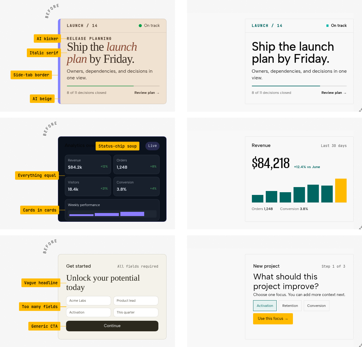
The ten tells on that hero are a useful test of the three piles. Five of them have a detector rule with the same meaning: side-tab border (side-tab), AI kicker (kicker-above-heading), italic serif (italic-serif-display), AI beige (cream-palette) and cards in cards (nested-cards). The other five do not. Status-chip soup, everything equal, vague headline, too many fields and generic CTA are judgments about content and hierarchy. Only the model's review in critique, or a rewrite in clarify and distill, can catch them. Half the marketing is measurable, and the other half is the part the model still has to judge.
The catalogue, counted
The registry is crates/foundation/src/registry.rs, mirrored as JSON in crates/live/assets/antipatterns.json. It lists 59 rules. Of these, 31 are categorised "slop" and 28 "quality". Their severities are 44 warnings, 13 advisories (listed but never counted in the exit code) and two errors (script-error, content-hidden-at-rest). The README says 59. The live home page says "61 checks". The /slop page renders 67 entries: the 59 rules, six marked "design review" that no code checks, and two the engine has since retired. The site lives in a private repository and trails the engine by a few days.
The "slop" and "quality" labels are the authors' categories. They do not tell you what a rule measures, so I sorted all 65 live entries by that instead. The split is my call, and the widget shows each rule's quoted text so you can disagree with it.
What the 65 catalogue entries measure
Showing 65 of 65.
Side-tab accent bordersource
side-tab“Thick colored border on one side of a card — the most recognizable tell of AI-generated UIs. Use a subtler accent or remove it entirely.”
crates/foundation/src/registry.rs:34
Border accent on rounded elementsource
border-accent-on-rounded“Thick accent border on a rounded card — the border clashes with the rounded corners. Remove the border or the border-radius.”
crates/foundation/src/registry.rs:44
Overused fontsource
overused-font“Inter, Roboto, Fraunces, Geist, Plus Jakarta Sans, and Space Grotesk are used on so many sites they no longer feel distinctive. Each new wave of AI-generated UIs converges on the same handful of faces. Choose a face that gives your interface personality.”
crates/foundation/src/registry.rs:54
Flat type hierarchysource
flat-type-hierarchy“Dominant heading and body roles are separated by less than 1.25× at every step, leaving the size hierarchy flat. Add at least one stronger size step.”
crates/foundation/src/registry.rs:64
Gradient textsource
gradient-text“Gradient text is decorative rather than meaningful — a common AI tell, especially on headings and metrics. Use solid colors for text.”
crates/foundation/src/registry.rs:74
AI color palettesource
ai-color-palette“Purple/violet gradients and cyan-on-dark are the most recognizable tells of AI-generated UIs. A gradient in one of those hues is the tell on its own; flat neon ink on a dark ground is charged once a second tell hue joins it. Choose a distinctive, intentional palette.”
crates/foundation/src/registry.rs:84
Cream / beige palettesource
cream-palette“A warm cream or beige page background has become the default "tasteful" AI surface, reached for by reflex. Choose a background that comes from a deliberate palette, not the safe warm off-white.”
crates/foundation/src/registry.rs:94
Nested cardssource
nested-cards“Cards inside cards create visual noise and excessive depth. Flatten the hierarchy — use spacing, typography, and dividers instead of nesting containers.”
crates/foundation/src/registry.rs:104
Monotonous spacingsource
monotonous-spacing“The same spacing value used everywhere — no rhythm, no variation. Use tight groupings for related items and generous separations between sections.”
crates/foundation/src/registry.rs:114
Bounce or elastic easingsource · advisory
bounce-easing“Bounce and elastic easing feel dated and tacky. Real objects decelerate smoothly — use exponential easing (ease-out-quart/quint/expo) instead.”
crates/foundation/src/registry.rs:124
Pulsing status dotsource
pulsing-dot“Small pulsing status dots simulate liveness decoratively. Reserve pulse animation for indicators tied to genuinely live, changing data; a static indicator with clear labeling is honest and calmer.”
crates/foundation/src/registry.rs:134
Decorative blinking cursorbrowser · advisory
blinking-cursor“A blinking text cursor animated into a hero or landing section simulates typing where no input exists. It borrows the dev-tool aesthetic as decoration. Real editable fields draw their own caret; anywhere else, let the composition hold attention without a fake prompt.”
crates/foundation/src/registry.rs:144
Shape-assembled illustrationsource · advisory
shape-assembled-illustration“A large inline SVG that builds a pictorial scene from a pile of primitive shapes reads as placeholder clip art, not illustration. Icons, logos, and data graphics are fine at their scale; a hero-sized visual deserves real artwork, a photograph, or a deliberately drawn graphic.”
crates/foundation/src/registry.rs:154
Organic contour drawn as clip-pathsource
organic-clip-path“A clip-path polygon with many arbitrary vertices, or a curved clip-path path(), is CSS approximating a torn edge, blob, or silhouette. It reads as the cheap version of the effect and is usually a produced or photographic material replaced with code. Derive an alpha matte from the real image, or ship the shape as a cut-out raster; keep clip-path for geometry (cut corners, diagonals, hexagons).”
crates/foundation/src/registry.rs:164
Raster buried under a wash or opacitysource
buried-raster“A background image under a near-opaque gradient wash, or a raster on an element at near-zero opacity, never reaches the screen: the page shows the wash, and the produced texture or photo ships as a compliance token. Let the material show (a tint under 0.9 alpha, a blend mode, an opacity you can see) or remove the file.”
crates/foundation/src/registry.rs:174
Glowing shadow accentssource
dark-glow“Colored glow shadows — a zero-offset chromatic halo (box- or text-shadow) on any background, or any colored blurred shadow on a dark background — are the default "cool" look of AI-generated UIs. Use neutral elevation shadows and subtle, purposeful lighting instead.”
crates/foundation/src/registry.rs:184
Radial-gradient background halosource
radial-halo“A chromatic radial-gradient wash — saturated at the center, fading to transparent — used as a decorative background glow on a dark page. Same tell as glowing shadows, drawn with a gradient instead of a shadow. Ground the surface with a solid or subtly shifted background instead.”
crates/foundation/src/registry.rs:194
Decorative radial spotlight glowsource
radial-spotlight-glow“An accent-colored radial gradient fading to transparent, dropped behind a hero or section as a "spotlight" and bright enough against that surface to read as a cloud floating over the copy. It is a reflex AI decoration — the translucent cousin of the saturated radial halo. Let the surface stand on its own, or light the composition with a deliberate material accent rather than a floating colored haze.”
crates/foundation/src/registry.rs:204
Auto-scrolling marqueesource
marquee“Continuously auto-scrolling content demands attention it has not earned and hides half its content at any moment. Reserve motion for content that changes; let readers move at their own pace.”
crates/foundation/src/registry.rs:214
Icon tile stacked above headingsource
icon-tile-stack“A small rounded-square icon container above a heading is the universal AI feature-card template — every generator outputs this exact shape. Try a side-by-side icon and heading, or let the icon sit in flow without its own container.”
crates/foundation/src/registry.rs:224
Italic serif display headlinesource
italic-serif-display“Oversized italic serif (Fraunces, Recoleta, Playfair, Newsreader-italic) as the primary hero headline reads as taste in isolation but has become the universal AI-startup landing page hero. Set roman, or move to a non-serif display face. Editorial / magazine register may legitimately want this — judge by context.”
crates/foundation/src/registry.rs:234
Hero eyebrow / pill chipsource
hero-eyebrow-chip“A tiny uppercase letter-spaced label sitting immediately above an oversized hero headline — or the same shape rendered as a pill chip — is now the default AI SaaS hero. Drop the eyebrow, integrate the kicker into the headline, or run it as a navigation breadcrumb instead.”
crates/foundation/src/registry.rs:244
Kicker / eyebrow label above headingsource
kicker-above-heading“A tiny tracked uppercase or small-caps label sitting as its own block directly above a heading is banned outright, repeated or not. Generated kickers never earn their place: the heading carries its own weight. Delete the label and let the heading speak; if the words matter, work them into the heading or the body.”
crates/foundation/src/registry.rs:254
Tiny numbered section labelssource · advisory
numbered-section-labels“Small numeric index labels riding next to section headings, repeated section after section, are AI editorial scaffolding — a page numbering its own chapters instead of earning structure. Let hierarchy, content, and rhythm carry the sequence.”
crates/foundation/src/registry.rs:264
Em-dash overusesource · advisory
em-dash-overuse“Em-dash saturation in body copy is an AI cadence tell. Advisory only: humans use em-dashes legitimately, so this fires only on saturation — at least 8 em-dashes (— or --) at a density near one per 500 characters of body text — never on a long article that uses a few. Prefer commas, colons, periods, or parentheses.”
crates/foundation/src/registry.rs:274
Marketing buzzwordsource
marketing-buzzword“Generic SaaS phrases (streamline / empower / supercharge / world-class / enterprise-grade / next-generation / cutting-edge / etc) are instant AI tells. Pick a specific verb and noun that says what the product literally does.”
crates/foundation/src/registry.rs:284
Aphoristic-cadence copysource
aphoristic-cadence“Three or more sections landing on a short rebuttal sentence ("X. No Y." / "X. Just Y.") or a manufactured-contrast aphorism ("Not a feature. A platform.") reads as AI cadence, not voice. Once is fine; the pattern is the tell.”
crates/foundation/src/registry.rs:294
Oversized hero headlinesource
oversized-h1“A full-sentence headline set at display size ends up dominating the viewport, leaving no room for anything else above the fold. A punchy one- or two-word headline at that size is fine — the problem is a long headline blown up too large. Set long headlines smaller, or tighten the copy.”
crates/foundation/src/registry.rs:304
Crushed letter spacingsource
extreme-negative-tracking“Letter-spacing pulled tighter than the point where characters keep their own shapes costs legibility. Tighten display type optically, not destructively.”
crates/foundation/src/registry.rs:314
Broken or placeholder imagesource
broken-image“<img> tags with empty src, missing src, or placeholder values ship as broken-image boxes. Use real images, generated assets, or remove the tag.”
crates/foundation/src/registry.rs:324
Uncaught script error on loadbrowser · error
script-error“A script threw an uncaught exception or failed to parse while the page loaded. Broken JavaScript silently kills reveals, interactions, and dynamic content, and can leave most of a page invisible. Fix the error before judging anything else.”
crates/foundation/src/registry.rs:334
Content invisible at restbrowser · error
content-hidden-at-rest“A large share of the page text sits at opacity 0 or visibility hidden even after every reveal handler had a chance to run. This is the failed-reveal signature: the content shipped but never becomes visible. Make content visible by default and let JavaScript enhance its entrance instead of gating its existence.”
crates/foundation/src/registry.rs:344
Cards flush against the scroller edgebrowser
edge-flush-cards“Cards inside a horizontal scroller or tab panel sit flush against the container edge at rest while keeping a gutter on the other side, so their edges and rounded corners get cut off. Usually the panel is sized wider than its clip box. Keep a consistent inset on both sides.”
crates/foundation/src/registry.rs:354
Text occluded by an overlapping elementbrowser
text-occlusion“Text is painted under an opaque element or a second text run, so part of it cannot be read. A decorative box, a stacked layer, or an inline element with leaked padding lands on the words instead of beside them. Give overlapping layers room, or move the text out from under the layer above it.”
crates/foundation/src/registry.rs:364
One column stretches the first viewportbrowser
first-viewport-column-overflow“A multi-column opening section lets one column run far past the fold while its sibling fits in a single viewport, so the short column floats in dead space and the fold falls deep inside one section. Balance the columns, cap the tall one, or let the long content flow below the opening row.”
crates/foundation/src/registry.rs:374
Gray text on colored backgroundsource
gray-on-color“Gray text looks washed out on colored backgrounds. Use a darker shade of the background color instead, or white/near-white for contrast.”
crates/foundation/src/registry.rs:384
Low contrast textsource
low-contrast“Text does not meet WCAG AA contrast requirements (4.5:1 for body, 3:1 for large text). Increase the contrast between text and background.”
crates/foundation/src/registry.rs:394
Line length too longbrowser
line-length“Text lines wider than ~80 characters are hard to read. The eye loses its place tracking back to the start of the next line, so it is measured on the lines that rendered and charged when more than one of them runs long. Add a max-width (65ch to 75ch) to text containers.”
crates/foundation/src/registry.rs:404
Cramped paddingbrowser
cramped-padding“Text is too close to the edge of its container. Two shapes: (1) an element with its own text where the space between the rendered text and the border box is too small for the font size, and (2) a wrapper whose children's text lands flush against a visible boundary (border, outline, or non-transparent background) with nothing to inset it. Add at least 8px (ideally 12–16px) of space inside bordered, outlined, or colored containers.”
crates/foundation/src/registry.rs:414
Body text touching viewport edgebrowser
body-text-viewport-edge“Body paragraphs render flush against the left or right viewport edge with no container providing horizontal padding: closer than 16px, or 12px on viewports 480px wide or narrower. Wrap content in a container with at least 16px (ideally 24-32px) of horizontal padding, or apply max-width with mx-auto. Body text that runs past the viewport edge is reported once per page as overflow, naming the widest element: constrain that element's width instead of adding padding.”
crates/foundation/src/registry.rs:424
Tight line heightsource
tight-leading“Line height below 1.3x the font size makes multi-line text hard to read. Use 1.5 to 1.7 for body text so lines have room to breathe.”
crates/foundation/src/registry.rs:434
Skipped heading levelsource
skipped-heading“Heading levels should not skip (e.g. h1 then h3 with no h2). Screen readers use heading hierarchy for navigation. Skipping levels breaks the document outline.”
crates/foundation/src/registry.rs:444
Heading crowded against the previous blockbrowser
heading-rhythm“A heading binds to the content it introduces, so the rendered space above it should exceed the space below it. When headings across a page sit as close or closer to the block above than to their own content, every section reads as if it captions the previous one. Open up the space above each heading.”
crates/foundation/src/registry.rs:454
Justified textsource
justified-text“In a column this narrow, justifying without hyphenation stretches the word spaces until vertical rivers of white run down the block. Use text-align: left, widen the measure, or enable hyphens: auto if you must justify. Scripts that justify on a character grid or by elongating glyphs, such as CJK, Thai and Arabic, are not affected and are not reported.”
crates/foundation/src/registry.rs:464
Tiny body textsource
tiny-text“Body text below 12px is hard to read, especially on high-DPI screens. Use at least 14px for body content, 16px is ideal.”
crates/foundation/src/registry.rs:474
Undersized functional textsource
undersized-ui-text“Interactive and content-bearing UI text (links, buttons, nav items, labels, table cells, meta rows, timecodes) below 11px is a legibility failure, not a style choice. WCAG sets no absolute pixel floor, but functional text under 11px is a defensible quality bar: it fails on high-DPI and small viewports and it degrades tap and read targets. The 11px floor holds even inside a footer; only non-interactive legal smallprint gets the softer 10px floor. Being ON the DESIGN.md size ramp does not exempt a value here: adding 8px to the ramp launders the token but not the legibility problem, and that is exactly the escape hatch this rule closes. Exempts sup/sub, visually-hidden (sr-only) text, and code/terminal contexts. Decorative letterspaced micro-labels are still functional and stay in scope.”
crates/foundation/src/registry.rs:484
All-caps body textsource
all-caps-body“Long passages in uppercase are hard to read. We recognize words by shape (ascenders and descenders), which all-caps removes. Reserve uppercase for short labels and headings. Only a run that reads as a sentence counts: 80 characters or more of an element's own text. Buttons, nav items, kickers and eyebrows set in caps are a convention and stay silent.”
crates/foundation/src/registry.rs:494
Wide letter spacing on body textsource
wide-tracking“Letter spacing above 0.05em on body text disrupts natural character groupings and slows reading. Reserve wide tracking for short uppercase labels only.”
crates/foundation/src/registry.rs:504
Content overflowing its containerbrowser
text-overflow“Content renders wider than its container and the spill does harm: a clipping ancestor cuts it off, it runs into another box, or it reaches the viewport edge. Let text wrap, constrain widths, or give the region a deliberate scroll affordance.”
crates/foundation/src/registry.rs:514
Same text repeated inside one containersource
repeated-container-text“The same literal text rendered three or more times in structurally different spots inside a single card or panel is redundant messaging — usually a status or label wired into every slot of a template. Say it once, in the slot where it matters most.”
crates/foundation/src/registry.rs:524
Positioned child clipped by overflow containerbrowser · advisory
clipped-overflow-container“A clipping container (overflow hidden or clip) wrapping an absolutely-positioned child cuts off tooltips, menus, and popovers that need to escape. Let the overflow be visible, or move the positioned layer out of the clip.”
crates/foundation/src/registry.rs:534
Font outside DESIGN.mdsource
design-system-font“A font is used that is not declared in DESIGN.md typography. Use the documented type system or update DESIGN.md if this is an intentional brand addition.”
crates/foundation/src/registry.rs:544
Color outside DESIGN.mdsource · advisory
design-system-color“A literal color is outside the DESIGN.md palette and sidecar tonal ramps. This may be legitimate, but it should be an intentional design-system addition rather than drift.”
crates/foundation/src/registry.rs:554
Radius outside DESIGN.mdsource · advisory
design-system-radius“A border-radius value is outside the DESIGN.md rounded scale. Use a documented radius token or update the design system if the new shape is intentional.”
crates/foundation/src/registry.rs:564
Font size outside DESIGN.mdsource · advisory
design-system-font-size“A literal font-size is off the type ramp documented in DESIGN.md typography. Use a documented size step or update the design system if the new step is intentional.”
crates/foundation/src/registry.rs:574
Hairline border with wide shadowsource · advisory
gpt-thin-border-wide-shadow“Every card of this row wears a hairline border paired with a wide, diffuse shadow, which is a recurring generated-UI signature. One floating panel earns both; a whole row wearing them reads as a default nobody chose. Across the row, commit to one: a defined edge or a soft elevation.”
crates/foundation/src/registry.rs:584
Repeating-gradient stripessource · advisory
repeating-stripes-gradient“Repeating-gradient stripes used as surface decoration are a recurring generated-UI signature. Reach for a deliberate texture or leave the surface plain.”
crates/foundation/src/registry.rs:594
Decorative grid-line backgroundsource · advisory
codex-grid-background“A decorative grid or line-field background drawn with hairline linear-gradient layers tiled by a fixed pixel cell is a recurring generated-UI signature. Reserve grid overlays for actual canvas, map, blueprint, or measurement surfaces; elsewhere use product structure or a plain surface.”
crates/foundation/src/registry.rs:604
Theater framing copysource · advisory
theater-slop-phrase“Dismissing something as "theater" is a recurring generated-copy tic. Say plainly what the thing does or does not do.”
crates/foundation/src/registry.rs:614
Glassmorphism everywheremodel review
glassmorphism“Blur effects, glass cards, and glow borders used as decoration rather than to solve a real layering problem.”
impeccable.style/slop (no detector rule)
Extreme border-radius on cardsmodel review
over-round“Large corner radii can squeeze the content and make every card look alike. Reduce the curve to suit the card’s size and give its contents room.”
impeccable.style/slop (no detector rule)
Rough SVG illustrationsmodel review
sketchy-svg“A hastily drawn mascot or scene can make a finished page feel unfinished. Use a well-made illustration or photo, or leave it out.”
impeccable.style/slop (no detector rule)
Single font for everythingmodel review
single-font“One font family can work well across a whole page. If everything feels flat, vary size, weight, and spacing before deciding whether a second family would help.”
impeccable.style/slop (no detector rule)
Hero metric layoutmodel review
hero-metric-layout“A huge number with a small label and supporting stats is a familiar landing-page template. Lead with a metric when it helps explain the product, and give it enough context to mean something.”
impeccable.style/slop (no detector rule)
Identical card gridsmodel review
identical-card-grids“Repeated icon, heading, and text cards give every point the same weight. Group related ideas and vary the layout when the content needs different treatment.”
impeccable.style/slop (no detector rule)
Thirty-three entries are taste written down as a threshold. The authors have judged a habit to be generated, and given it a number so code can find it: cream backgrounds, Inter and Geist, purple gradients, kickers, em-dash density, "theater". Thirteen are readability checks against standards that predate generated UI by decades: WCAG contrast, an 11px floor for functional text, line length, leading, skipped heading levels. Nine are plain defects: a broken image, a script error, text hidden at rest, text clipped or covered. Four compare your values against your own DESIGN.md. Six are left to the model.
That answers the question I came with. The vocabulary is mostly a list of refusals. About half of it has been turned into code that measures, and only about a third of the measuring code checks something a non-designer could verify from first principles.
How a taste becomes a number
The taste rules are worth reading one at a time. Each one forces a vague complaint into a decision someone can argue with. "AI beige" becomes this:
// crates/core/src/checks/measures.rs:392
pub fn is_cream_color(rgb: Option<&Rgba>) -> bool {
    let Some(c) = rgb else { return false };
    let (r, g, b) = (c.r, c.g, c.b);
    if math_min3(r, g, b) < 209.0 { return false; }
    if !(r >= g && g >= b) { return false; }
    let warmth = r - b;
    warmth >= 6.0 && warmth <= 48.0
}
A colour counts as cream when every channel is at 209 or above, red is at least green and green at least blue, and red minus blue lands between 6 and 48. An ivory of #fbf8f1 has a warmth of 10 and is cream. A warm white of #f7f7f5 has a warmth of 2 and is not. Nobody would arrive at those bounds from colour science. They are someone's eye, made precise enough to argue about, and that precision is what makes the rule useful.
The side stripe is a geometry rule (crates/core/src/checks/rules.rs:301). A coloured border fires on a rounded card at 2px or wider, and on a square one at 3px. The other sides have to be 1px or less, or at most half the stripe's width. Neutral greys are exempt, and so are tables, badges and anything in a status context. The em-dash rule is "advisory only" and needs both at least 8 dashes and at least one per 500 characters of body text (crates/foundation/src/rules/text.rs:398-401). The font rule is a list of 17 names, from Inter and Roboto to "the Anthropic-skill / Vercel / GitHub default wave" of Fraunces, Geist and Space Grotesk (crates/foundation/src/constants.rs:85). In the browser engine it fires only when one of them sets at least 5% of the page's characters, a floor the code comment says sits clear of the two smallest real cases the corpus found (crates/core/src/browser/page_checks.rs:112-115).
I rebuilt thirteen of these patterns on one sample card. Every switch changes what the card renders, and the checker on the right runs a small port of the named rule with the same threshold. The background swatches include that ivory, so you can watch cream-palette fire on a colour most people would call white.
Turn the tells on and off
0 of 13 checks fire
Nightly eval finished
Eight regressions, all in the parser suite.
A sample card. Its colours are literal because the rules read literal colours; it does not follow the page theme.
Left stripe 0px (fires at 2px on a rounded card)
Body text contrast 9.4:1 (needs 4.5:1)
Heading size, relative to body 1.50× (needs 1.25×)
No rule fires. That says the card avoids thirteen known patterns, not that it is well designed.
Two things stood out while I built it. The readability rules have outside anchors: 4.5:1 is the WCAG figure, and nobody has to take Impeccable's word for it. The taste rules have only the authors' eye behind them. Some sit on a knife edge. A beige of #f3ead8 has a warmth of 27 and would still fire at 47. Move it one notch warmer and it stops being "cream" without looking any different. That is the price of turning taste into a number. The code becomes repeatable, but its edges are arbitrary.
The clever part is the corpus
What keeps the taste rules honest is not the rules but tests/oracle/DELTAS.md. It is 7,015 lines and 109 dated entries, each recording one decision about a rule's behaviour. Many of the decisions come from running the detector on real websites and having two judges label whether each finding actually hurt the page.
A corpus review of 50 real sites judged all three rules on their findings. Two measure exactly what they claim and are almost never harmful where they fire (
layout-transition1,435 findings on 37 sites, harmful in 9% of the judged representatives;bounce-easing160 findings on 13 sites, harmful in none), so their registry severity is nowadvisory
tests/oracle/DELTAS.md:304-308
The same entry retires image-hover-transform outright, because "hover zoom on a card image is a long-standing convention rather than a generated-UI tell, and it fired on mobile captures where hover cannot happen" (:309-312). On 6 October, after two more cohorts in which "both judges called every finding harmless", layout-transition was removed from the registry too (:7006-7008). The count dropped to 59.
I think this is the best idea in the project. Most lint rule sets only grow. This one gets taken back to the web, measured for harm, and trimmed. Most entries are about precision, not recall. Known consent banners are hidden before a URL scan (DELTAS.md:4576). Ad-tech script errors become advisory and name the vendor, sliders that never started are left out of the hidden-text count, and a purple heading that matches the brand's own logo colour stops counting as an AI palette (docs/CLI-CONTRACT.md:354-359). Each carve-out is a false positive somebody hit on a real page.
It also shows the cost. Those carve-outs are why the engine is 211,930 lines of Rust across 384 files. The browser rules alone run to 9,004 lines in element_checks.rs and 6,891 in page_checks.rs. The engine is a port of an earlier JavaScript engine. docs/PORTING-GUIDE.md:20 says "Port the behavior, including bugs", and 1,410 test files in tests/oracle/ pin the Rust output byte for byte to the JS goldens.
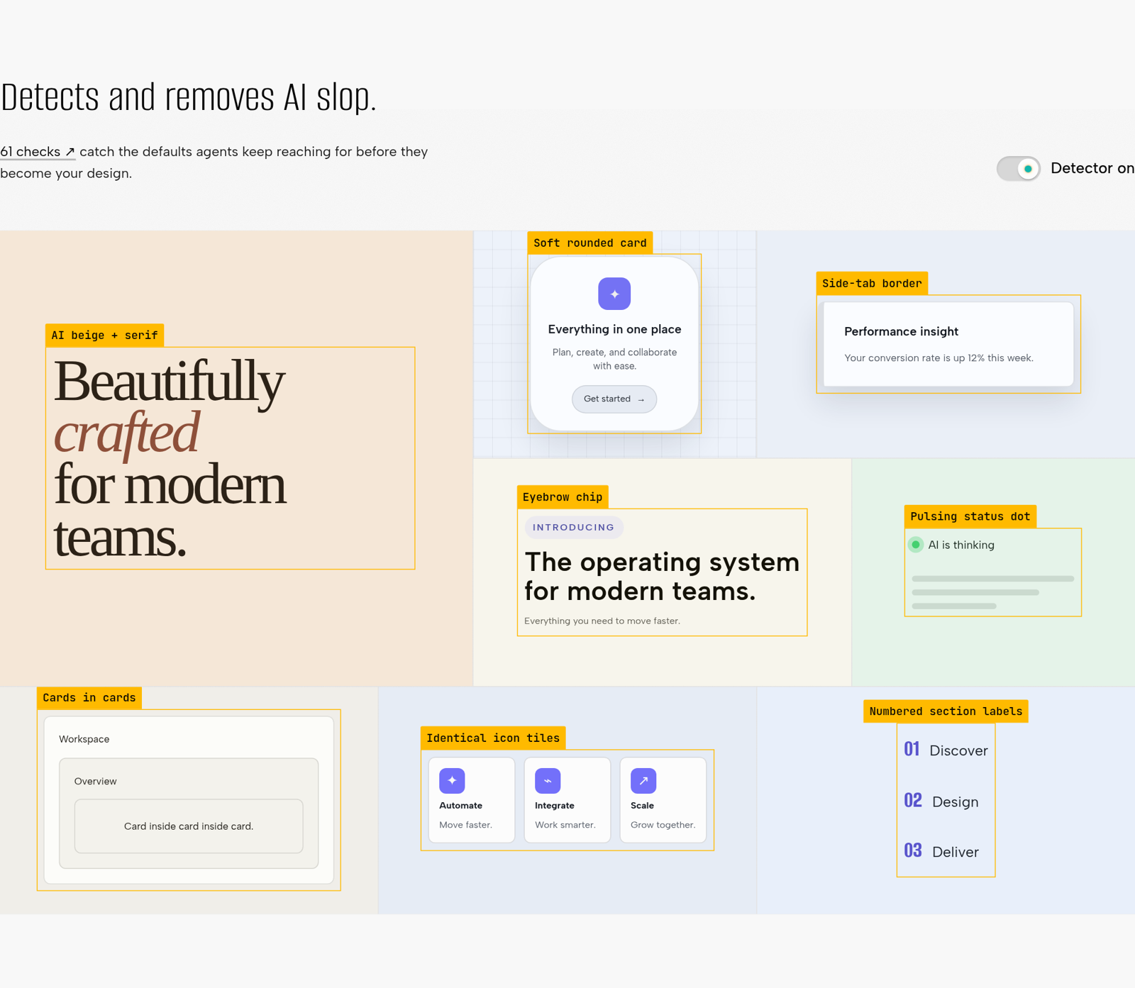
Three engines, and an ordering rule
impeccable detect picks an engine from its target. Source files (.tsx, .vue, .css and so on) go through regex matchers. HTML files go through a static engine with its own parser and CSS cascade. A URL goes to a real Chrome over CDP, which renders the page, sweeps it for scroll reveals, reads computed styles and the painted geometry, and samples screenshot pixels where text sits on an image. The same core compiles to WebAssembly for the Chrome extension, a 2.7 MB generated bundle in crates/live/assets/. No engine calls a model, and none needs an API key.
The hooks split the rules into two tiers. After each edit, only "mechanical, unambiguous problems worth interrupting an edit for" are surfaced: broken images, overflow, contrast, gradient text, glow, design-system drift. Copy cadence, palette taste and layout rhythm wait for a deep pass on Stop (skill/reference/hooks.md:7). This is a good call. An agent that gets told about em-dashes on every keystroke learns to ignore the hook.
The cleverest rule in the skill text governs the model and the detector together. critique runs two assessments as separate sub-agents: a design review by the model, and the detector plus a browser pass. The order is enforced:
Assessment A must finish before detector findings enter the parent synthesis context. Detector output is deterministic, but it still anchors judgment.
skill/reference/critique.md:10
A run without sub-agents has to start its report with a ⚠️ DEGRADED banner (:9). Whoever wrote that has watched a model read a lint report and then "find" exactly those issues and nothing else. It is the same discipline as checking an agent's work with something that is not the agent, which is what I looked for in three other harnesses.
Live mode, the gallery and the dice
/impeccable live is the one part that needs a running dev server. The engine injects a picker into your local app (Vite, Next.js, SvelteKit, Astro, Nuxt, Bun or static HTML; no native apps, no deployed sites). You select an element and describe the change. The agent writes three variants that are hot-swapped in place through HMR, and when you accept one, it is written back into your source. Under the hood it is a long-poll loop. live.md tells each harness how to hold it: a background task in Claude Code, a one-shot background terminal in Cursor, a foreground exec session that Codex must "SERVICE" (skill/reference/live.md:26-30). generate does the same for a named element, without the picking.
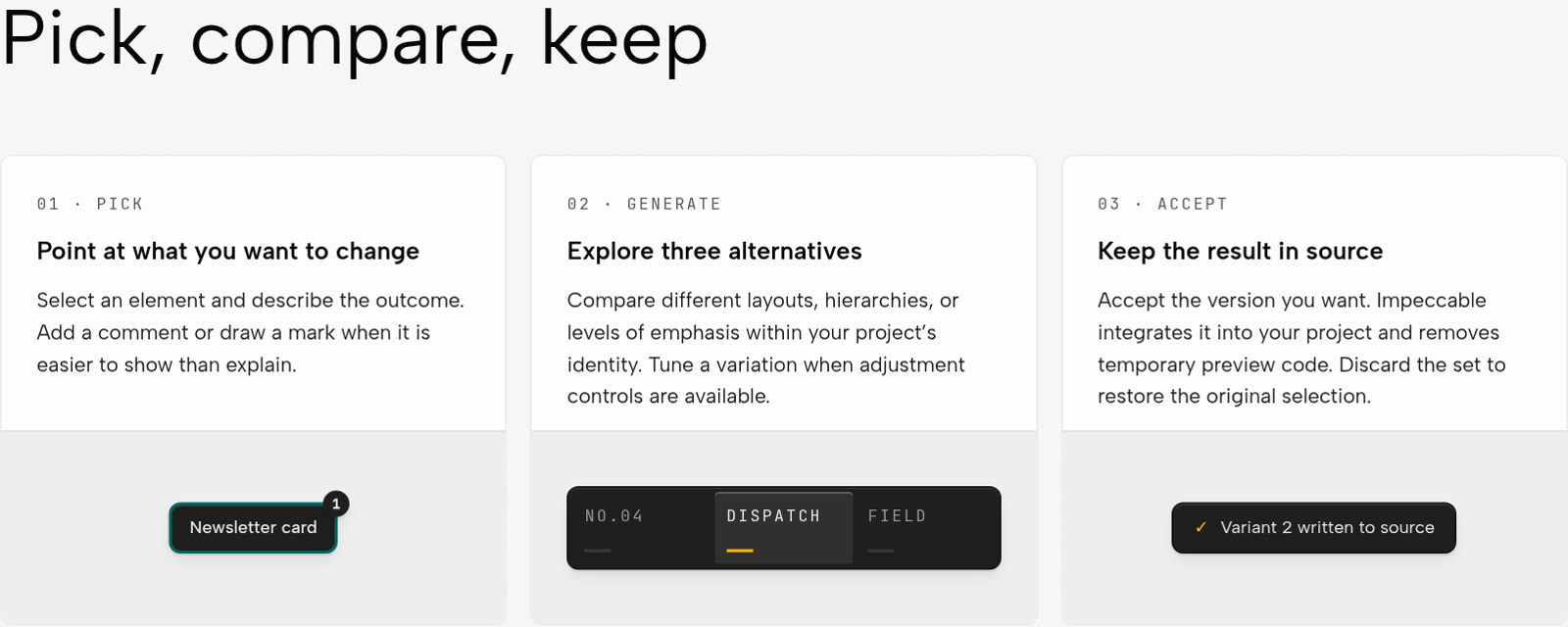
The gallery is the closest thing to a benchmark the project publishes. Seven briefs, each run on the same model with and without Impeccable. The page says "first-pass results, before manual polish", with "image generation available to both". Without Impeccable there are five runs per brief, and with it three.
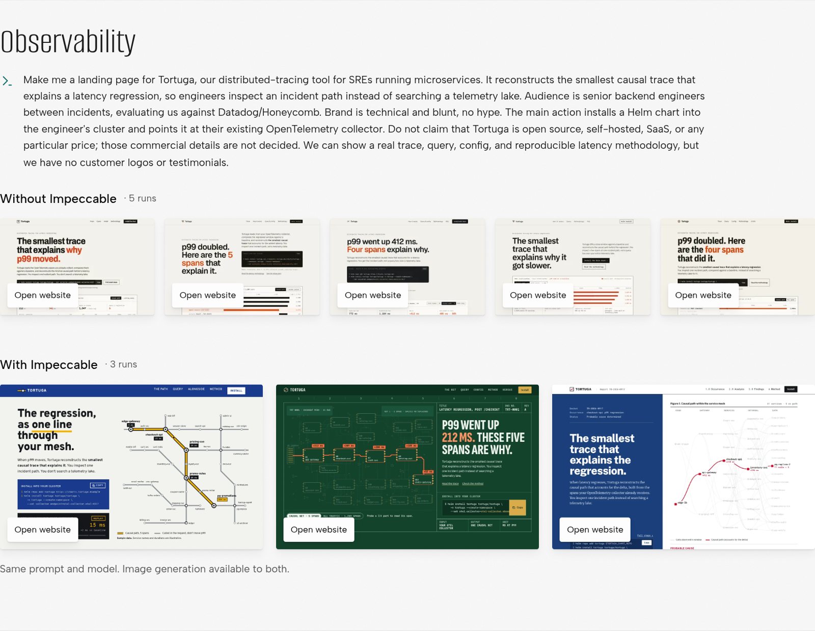
The Observability row shows the claim better than any testimonial. The five baseline runs are the same page five times: cream ground, black headline, "the smallest trace that explains" in the first line. The three Impeccable runs differ from each other. That difference comes less from the anti-pattern list than from a mechanism the research page calls "The model can't roll its own dice". Across sixteen creative framings, "Thirty of thirty-five responses proposed the same concept". When the model ranked its own shortlist, "option one won in 27 of 30 packets". So the skill has the model propose directions and has a script pick one: concept-seed "assigns the direction to build and deals catalog challengers" (skill/reference/new-work.md:48).
The catalog of directions it deals from is not in the repository. It is served from /api/roll on impeccable.style. The request carries a scope, a mode, an eight-hex seed key and a re-roll counter, and a separate choice ping honours DO_NOT_TRACK (CLAUDE.md:95). The repo's own guidance is blunt about why: "Never add catalog data files back to this repo; the catalog is the paid-service moat" (CLAUDE.md:98). The research page puts the campaign at "about $2,600 in evaluations", reports a catalog of 375 reviewed entries (188 approved), and says the final workflow "won 100% of decisive pairs" against the strongest competing skill. A separate model judged those pairs, and I could not reproduce any of it, since the evaluation set is private too. Without network access, the roll degrades to the model's own list with the assignment still applied.
What happened when I ran it on this page
The site owner asked for this article to be built with Impeccable itself: first its widgets, then the whole page. So I treated the cloned skill files as my instructions, ran its passes in the order the references hand off (critique and audit first, then distill, clarify and polish), and ran its detector before and after. The detector was the published @impeccable/cli-linux-x64 0.1.11 binary, downloaded from npm with its integrity hash checked and no install scripts run. I rendered the page in my own headless Chromium and pointed the binary's URL engine at that file, without a model or an API key. The design review in critique needs a model. It asks for an isolated sub-agent, so I gave a separate agent the screenshots and source, kept the detector output away from it, and merged the two reports afterwards, as critique.md:10 requires.
The first draft was what I write by default for this site. It had a bordered panel with a small uppercase "INTERACTIVE · SLOP BENCH" label, a row of three big-number tiles, grey panels inside the panel, and findings as cards with a 3px coloured left border.
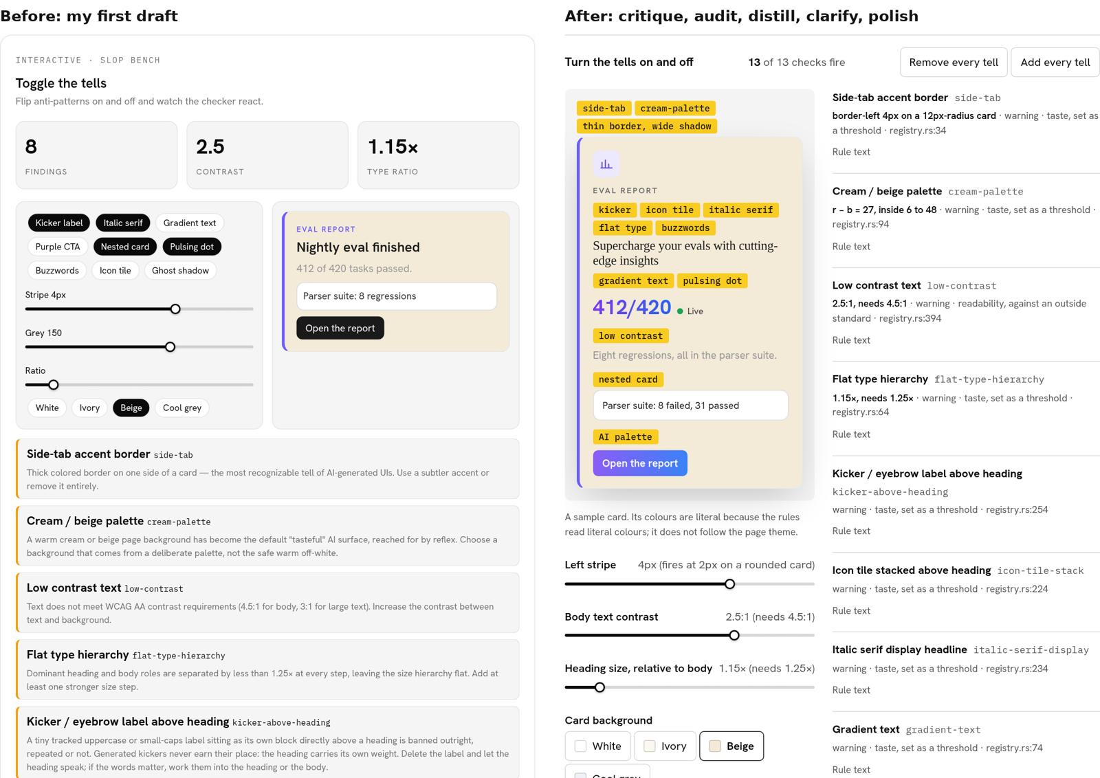
The passes, in the order I ran them
Each entry names the command, when it ran and the reference line it acted on.
- critiquefirst draftcritique.md:10
The design review was blunt. It scored the draft 16 of 32 on the heuristics it could apply and called it generic. Its top finding (P0) was that seven of the nine switches changed nothing on the sample card and only added a line to the list: "'Watch the checker react' becomes 'trust me'". Its P1s were that the ledger silently showed 8 of 65 rows, that the draft committed five of the patterns it was teaching (eyebrow, side stripes, nested cards, hero-metric tiles, a ghost shadow), and that the two-column grid had no phone layout.
- detectfirst draft
The detector, run separately, found 46 problems in the rendered page. They included 17
side-tabhits, all but one on my own finding cards, and 19low-contrasthits. Sixteen of those were the site's--muted-foregroundon--muted, at 4.3:1. - auditaudit.md:58-62
audittold me to run the detector and verify each finding in context. Two were mine: the ledger's rule text ran 81 to 83 characters a line, so it is now capped at 60ch, and the ledger rows put their padding onsummary, not on the borderedli. - distilldistill.md:52,56
distillasked for "One font family, 3-4 sizes maximum" and "one spacing scale". The widget's chrome went from six text sizes to four and from eleven spacing values to six, and each rule's full text now sits behind a "Rule text" disclosure. - clarifyclarify.md:35
clarifyasked that labels "describe what will happen". "Clean card" became "Remove every tell", a slider that read "Grey 150" now reads "Body text contrast 2.5:1 (needs 4.5:1)", and every slider states its threshold. - polishpolish.md:73-74,89
polishasked for focus, hover and touch states and a check at every viewport. That pass gave every control a visible focus ring and 44px targets on touch screens. It also caught one problem outside my code: at phone width the site's own figure "expand" button is 10px text at 70% opacity on a blurred chip, which the detector measured at 1.9:1. This page overrides it. - detectafter the passes
After the passes the detector reported two findings on the rendered page in light mode, dark mode and at 390px. Neither is a defect. One is
layout-transitionon a site-wide Tailwind utility, a rule HEAD retired on 6 October that the 0.1.11 binary still ships. The other istheater-slop-phrase, which fires because the ledger quotes the rule called "Theater framing copy".With every tell switched on, the detector found ten more, all on the sample card. They overlap the bench's own checker and add two contrast failures I had not built on purpose: the kicker's grey on beige at 4.46:1 and white on the purple button at 3.7:1. The detector missed some of what the bench builds, though, and the misses are instructive.
kicker-above-headinganditalic-serif-displaylook for anh1toh4orrole="heading", and my sample card's title is a paragraph, so neither fired.cream-paletteonly reads the page background. Pointed at the component source, the regex engine found one pattern of thirteen, thebackground-clip: textgradient; a coloured stripe set in a React style object is invisible to it. I added a file-level waiver,impeccable-disable …: documentation of bad design, the narrow exceptionhooks.mdallows for "documentation of bad design", and the source scan exits 0. - typeset, layout, colorizethe whole pagemode-read.md:7
At that point the widgets were done but the page was not. It had the same title block and plain column as every other article on this site, with a wrapper that only narrowed the measure and lifted the contrast. The owner asked for the page itself to be designed, so I worked through the three references that shape a page rather than a component, against the brief
mode-read.md:7gives a reading surface: "The world owns the frame and serves the column." This time I did the design assessment myself rather than in a separate agent.The frame is set like a proof sheet. The title puts the product's name at display size and the claim under it, and marks the verdict in the detector's annotation yellow. That yellow is the page's one accent, and it appears elsewhere only on findings and on the command names in this log (
colorize.md:42). No heading has a label above it (craft-floor.md:27). A section opens with a 2px ink rule, a heading hung into the left margin and a first line set in semibold, with four times as much space above the heading as below it (craft-floor.md:11). The skill's own sentences are set as pull quotes in the reading face, ruled above and below instead of striped down the side (craft-floor.md:35), with the file and line under them. Figures take the column, both margins or the full width, depending on how much detail they carry.The column stays calm. Body text is Newsreader at 19px, a serif loaded on this page and no other.
typeset.md:57allows a second family only for a role the first cannot do, and long reading is that role here; the site's Hanken Grotesk keeps the headings and every control. The column is 34rem wide. On a render I counted 69 characters a line at the median, and 63 to 73 on nine lines in ten, against the 60 to 75 thatmode-read.md:15asks for. Ink and paper are tinted blue in both themes, and I computed every text pair instead of judging it by eye: body text is 17.5:1 and secondary text 7.3:1 in light mode, 16.8:1 and 9.6:1 in dark. Spacing comes from one 4px scale (layout.md:49). The only animation is the title's mark being laid down once, in the light theme, and it does not run for readers who ask for reduced motion (craft-floor.md:13). - detectthe whole page
I ran the same binary on a static render of the new page: its own components and MDX compiled the way the build compiles them, with the site's stylesheet, in light mode, dark mode and at 390px. The site header and footer were left out. The first pass found 41 problems in light mode at 1280px. Twelve were my own. Every section rule was 3px, and a square border on one side counts as
side-tabfrom 3px, so the rules are now 2px; and the command names in this log had 2.5px of padding above and below their text. Most of the rest came from the site's shared pieces, which this page now sets in its own terms. The repo card's labels were 9px and 10px, and its tinted header strip read as a card inside the card. The related-article summaries ran to about 124 characters a line.After those fixes each pass reports four findings, one of them advisory. Two are the known ones,
layout-transitionand the quoted "Theater". One is white on#ff6600, the Hacker News mark in the site's share buttons, and I left a brand mark alone. The last istight-leading, at 1.15 on the title's second line. The rule asks for 1.5 to 1.7 "for body text", and this is a display line of up to 44px, so I kept it. That is the judgementaudit.mdasks for: check each finding in context instead of clearing the list.
Two rules contradict each other, and this page had to pick. The README says "Don't use pure black/gray (always tint)" (README.md:89), while colorize.md:44 says "Neutral gray is valid when it serves the world". The rest of this site is a deliberate pure-neutral ramp and stays one. This page tints, because a blue-black ink is what lets the yellow read as a mark. craft-floor.md:15 asks for themed custom scrollbars, while operate.md:50 lists "custom scrollbars" among reinvented affordances to avoid. I themed the selection, focus rings, caret and link underlines, and left scrollbars alone. The sample card keeps literal hex colours in both themes, because the rules read literal colours. Its caption says so.
How this site compares
This site is also built by agents, and it has its own design step. brand-crew/agents/design-reviewer.md is a read-only reviewer. It checks theme tokens, fonts, the shared shell, reduced motion and dark mode, and it is good at keeping pages consistent with each other. It has no opinion on hierarchy, measure or contrast, and that is how 98-character lines and 4.3:1 secondary text had lived in the default styles without anyone noticing. Impeccable's own repository has the prose half of what our voice.md does. Its docs/STYLE.md is an editorial brief, and its build's validateProse step fails on a denylist ("load-bearing", "highest-leverage", "biggest unlock"), the same idea as this site's banned-phrase list. The difference is the visual detector. We lint words; they lint pixels too. The closest thing we have written about is json-render with Jev, which avoids bad generated UI by never letting the model emit the component tree at all.
What I would take, and what is thin
The detector is the part I would install. npx impeccable detect http://localhost:3000 runs on a CPU, needs no model, exits 2 when it finds something, and its readability and defect rules are worth having in CI on any front end. The corpus discipline behind it, where rules are measured for harm on real sites and retired when they are harmless, is what I would copy into my own lint rules.
The skill text is thinner than its size suggests. Much of it is excellent operational detail about harnesses, polling and drift. The design guidance itself is a short list of refusals plus four modes, and 60,000 words of instructions is a lot of context to spend for that. The taste rules will age. The registry already names model families, with gpt-thin-border-wide-shadow and codex-grid-background, and the font list has a section headed "Newer monoculture" next to the older one. A list of what generated UI looked like this year is a moving target. To their credit, the authors say so on the slop page: "AI slop changes with the era and the model."
The half of the vocabulary that matters most, whether the headline says something and whether everything carries the same weight, is still the model's judgment. The best thing Impeccable does there is procedural. It makes the model judge before it reads the lint report, and it makes a script pick the design direction so the model's favourite does not always win.
How I checked
I shallow-cloned pbakaus/impeccable (git clone --depth 1). The clone holds one commit, d98b0be, dated 7 October 2026 10:01 -0700, so I could not read the project's history. The npm registry dates the impeccable package to 30 March 2026, with 39 published versions; the latest is 4.1.0. I read SKILL.src.md, every file in skill/reference/ and skill/agents/, the docs, the build scripts, the launcher, the hooks, the registry and the rule code quoted above, and the DELTAS.md entries cited. Rule counts come from antipatterns.json and registry.rs, severities from the registry, line counts from git ls-files piped through wc. The catalogue split in the ledger is my own classification. I read every page of impeccable.style (home, Designing, Gallery, Docs, Slop, Live, Research) in my own headless Chromium and took the figures from those renders. The 76k star count is the site's badge; I could not check it against GitHub's API. The only third-party code I ran was the published detector binary (@impeccable/cli-linux-x64 0.1.11, sha512 checked against the npm registry, no install scripts), under nice, on renders of this article's own components and of this page. The gallery and research results are the project's own, judged by its own reviewers, and I could not reproduce them.