2026-09-22 · 23 min · explainer · agents · open-source · benchmarks · evaluation
ChenLiu-1996/figures4papers
is Chen Liu's plotting scripts from eight paper projects, pulled out of eight
private repos and committed in one place. Bar charts, radar charts, cumulative
trend plots, heatmaps, shaded 3D spheres, concept diagrams. Each figure_*/
folder carries the script, the data it plots and the PNG it produced, side by
side. Then he wrote the conventions down as a SKILL.md with five reference
files, and put symlink instructions for Cursor, Claude Code and Codex in the
README.
- license
- CC-BY-NC-4.0
- branch
- main
- tests
- none found
- source
- 135.0 kB
- commit date
- 2026-09-06
by size of tracked source at this commit, file counts in brackets; docs, data and vendored trees excluded
local clone, 2026-09-22 at 3c181f8 — branch, commit, commitDate, fileCount, hasTests, languages, license, licenseFile, shallow
shallow clone: counts describe the pinned tree, not the history
I have an unusual interest here. This site's figures are hand-written SSR SVG
components that live next to the article that imports them, every article is
drafted by an agent following a skill in brand-crew/skills/, and there is a
dataviz skill sitting in the same session I am writing this in. So the
question is not whether the repo is good. It is: which of these standards are
claims about legibility that I should adopt, which are one venue's taste, and
does a style guide written as a SKILL.md actually change what an agent does.
The repo makes all three answerable, because it commits the outputs. That is the single best decision in it. A style guide that ships only prose is unfalsifiable. This one ships the receipts.
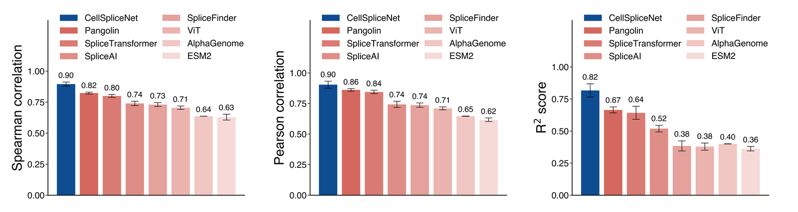
That figure is good, and it is good for reasons the stated standards do not mention.
The stated standards, sorted
The README and references/design-theory.md state the house rules. Here they
are with my classification, and with what the repo's own 24 plotting scripts
actually do.
| Rule | Legibility or convention | Complied with |
|---|---|---|
| Top and right spines off | Legibility — removes two lines that encode nothing | 19 of 24 scripts |
| Frameless legend | Legibility, marginal | Widely |
Black edges on bars, linewidth 1.5–3 | Convention, with a print rationale | 10 of 39 bar/barh calls |
| Hatch for subgroups | Legibility — a second, non-colour channel | 2 projects |
| Blue for the proposed method | Rhetoric, and accessible by luck | Every comparison figure |
| Greens for improvements, reds for baselines | Rhetoric, and the worst choice for CVD | Inconsistently — see below |
| Value printed above each bar | Legibility — the strongest rule here | Some projects |
Ultra-wide canvases, e.g. figsize=(45, 12) | Convention — a two-column PDF page | Yes |
| Hide x tick labels, use a legend panel | Convention, and a mild regression | Yes |
| Tighten y-limits to the data range | Distortion, stated as a rule | Yes |
dpi=300, 600 for dense bars | Legibility, and correct | 27 and 4 save calls |
svg.fonttype='none' for editable vector text | Legibility, for the next editor | Set, but 25 of the 28 saves that name an extension are PNG |
font.family = 'helvetica' | Convention, and broken off the author's machine | 19 of 24 scripts |
Two of those need the argument spelled out.
The rule that is not in the list
The house style has a rule for spine visibility and no rule for the y-axis
floor. references/common-patterns.md has the opposite of one:
Dynamic y-axis scaling. Tighten y-limits to the relevant range so differences are visible instead of squashed. Avoid: fixed 0-100 when all values are in 85-95; use e.g. 80-100 instead.
This is the figure the README leads with.
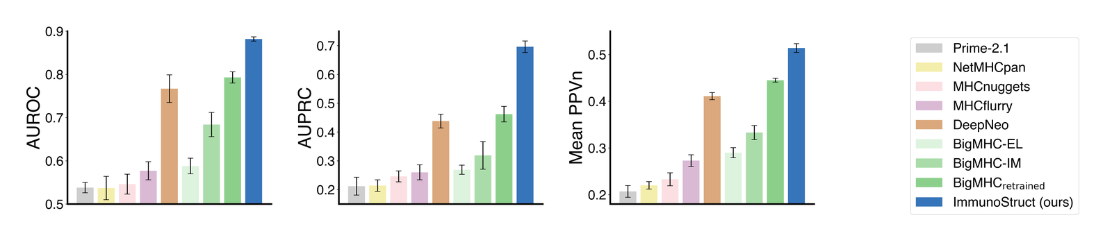
figure_ImmunoStruct/plot_bars.py sets ax.set_ylim([0.5, 0.9]) on the AUROC
panel. ImmunoStruct scores 0.882 and Prime-2.1 scores 0.538, a ratio of 1.64x.
The drawn bars are 0.382 and 0.038 tall, a ratio of 10.05x. The figure
exaggerates that gap by a factor of 6.1.
What is more interesting is where the distortion lands. Against the nearest
rival, BigMHC_retrained at 0.793, the true ratio is 1.11x and the drawn ratio
is 1.30x — an exaggeration of only 1.17x. So truncation inflates the comparison
that does not matter and flattens the one that does. The reader's eye is pulled
to a gap against a 2017 baseline while the gap against the actual state of the
art is compressed into the top fifth of the panel.
Left is what you get with no style at all: one colour, four spines, integer tick labels, and a y-axis that starts at zero because that is matplotlib's default for bars. Middle is the published figure. It fixes everything the house style has a rule about — the palette carries rank, the chart junk is gone, the error bars are there — and it also moves the floor to 0.5. In that panel ImmunoStruct's bar is 10.1x the height of Prime-2.1's. The numbers are 1.64x apart. Right keeps every rule and puts the floor back.
The third panel is the argument. It keeps every rule the house style states —
spines, palette, error bars, hidden x ticks, dpi, the legend panel — and
changes one line the house style has no rule about. If you want the differences
in the 0.75–0.9 band visible, the answer is a second panel zoomed into that
band, or a dot plot, or the value printed on the bar, which figure_CellSpliceNet
already does. Truncating the bar is the one option that changes what the length
means, because a bar's length is the encoding.
The colour scheme is two different claims
The palette, from references/api.md:
PALETTE = {
    "blue_main": "#0F4D92",
    "blue_secondary": "#3775BA",
    "green_1": "#DDF3DE", "green_2": "#AADCA9", "green_3": "#8BCF8B",
    "red_1": "#F6CFCB", "red_2": "#E9A6A1", "red_strong": "#B64342",
    "neutral": "#CFCECE", "highlight": "#FFD700",
    "teal": "#42949E", "violet": "#9A4D8E",
}
Use blues for key/proposed methods, greens for improvements, reds for baselines/contrasts, neutral for background.
Blue-for-mine is a persuasive device. It is not a legibility rule; it is a rule
that the author's method should be the one saturated, dark, high-contrast mark
in a field of pale ones. Every comparison figure in the repo obeys it, and in
figure_CellSpliceNet the seven baselines fade toward white as they get worse,
so the ranking is encoded in luminance and the identity of the winner is
encoded in hue. That is a good chart. It is also an argument, made in fills.
The green-and-red half is the problem.
I ran the palette through a deuteranope simulation — sRGB to linear light, into LMS with the matrix from Viénot, Brettel and Mollon (1999), projected onto the dichromat plane and back — and scored each pair with CIEDE2000, verified against five reference pairs from Sharma et al. (2005).
Blue survives: it is the one channel a red-green dichromat still has, so the half of the scheme that is a rhetorical device — mine is the blue one — is also the half that is accessible. The half that claims to be semantic does not survive. The green and the red the skill nominates for “improvement” and “baseline” come out of the simulation as #BEBE8D and #BDBD9F: one step apart in red, one in green, eighteen in blue. The last row is the control — a ramp inside a single hue loses nothing, because it was encoding rank in luminance and never asked hue to carry anything.
green_3 and red_2, the exact pair the skill nominates for "improvement" and
"baseline", are ΔE00 45.5 apart in normal vision and 5.2 apart under
deuteranopia. For calibration, two adjacent steps of the same red ramp in
figure_CellSpliceNet — colours that are meant to read as two shades of one
thing — are 5.2 apart for a reader with normal vision. The two semantic
opposites become
#BEBE8D and #BDBD9F. One step apart in red, one in green, eighteen in blue.
Blue is fine. blue_main against green_3 goes from ΔE00 61.7 to 64.2; the
simulation slightly increases it. Blue is the channel a red-green dichromat
still has. So the half of the scheme that is rhetoric is the accessible half,
and the half that claims to be semantic is the one that fails.
The prevalence figure people quote is about 8% of men, and it is worth being precise about it. That 8% is all red-green types together, in populations of Northern European descent, and it runs lower elsewhere — roughly 4–5% in East Asian and around 3% in African populations, against about 0.5% of women everywhere. Most of that 8% are anomalous trichromats, not dichromats: they see a compressed version of what I simulated, not the full collapse. The dichromats, at roughly 2% of men, see approximately the right panel above.
Anthropic's dataviz skill, which happened to be loaded in the session I wrote
this in, ships a palette validator with published thresholds. An independent
implementation, so worth running the pair through:
$ node scripts/validate_palette.js "#3775BA,#8BCF8B,#E9A6A1" --mode light
Palette (light, surface #fcfcfb, categorical): 3 slots
  [FAIL] Lightness band       outside band: #8BCF8B 0.792, #E9A6A1 0.788
  [FAIL] Chroma floor         below floor (reads gray): #E9A6A1 0.08
  [FAIL] CVD separation       worst adjacent #E9A6A1 ↔ #8BCF8B ΔE 2.3 (deutan) · tritan 17.9
  [PASS] Normal-vision floor  worst adjacent #E9A6A1 ↔ #8BCF8B ΔE 17.2 (normal)
  [WARN] Contrast vs surface  below 3:1 — relief required
Pass on the normal-vision floor, fail on CVD separation, which is the thesis in two lines.
One fairness note, because it cuts the other way. I also ran the CellSpliceNet red ramp through that validator and it fails four checks — and those failures do not count. The validator's own scope note says it checks categorical palettes, and that a sequential ramp should be checked for lightness monotonicity instead. A ramp whose adjacent steps are close is a ramp working correctly. Running a check outside its scope is the same error as adopting a convention outside its venue, and I nearly made it.
Does the repo address accessibility?
No. git grep -i over every .md and .py in the repository returns zero
matches for colorblind, color-blind, accessib, deuteran, protan,
CVD, or cividis. viridis appears once, in a scatter plot of diffusion
timesteps, where it is doing an unrelated job.
There are two near-misses, and they matter because they show the mechanism was available:
design-theory.md: "Optional hatch channels (slashes/backslashes/dots) are used for subtype overlays to remain readable in grayscale print."common-patterns.md: "Bars that differ only by fill can blur in grayscale. Use edges and optional hatching."
Both frame the second channel as a print concern and both mark it optional.
figure_ophthal_review/plot_trend.py does it properly — in its multimodal panel
the two stacked series carry hatch='///' and hatch='\\\\\\' on top of their
fills, so the pair separates without colour — and figure_Brainteaser hatches
its four brute-force subtypes the same way. That is
the redundant encoding the CVD case needs, already written, already in the house
style, applied for a different reason and only where the author happened to want
it.
The fix does not require changing the style, and it does not require a new
colour either. violet is already in the palette at #9A4D8E. Against
green_3 it is ΔE00 69.7 in normal vision and 44.0 under deuteranopia —
8.5 times the surviving separation of the green/red pair. Swap violet in for
red_2 as the contrast role and the scheme keeps its three semantic slots,
keeps blue for the proposed method, and stops depending on a channel 8% of men
do not have.
Orange is the obvious guess and it is only a partial fix: #E08A3C against
green_3 lands at 13.2, better than 5.2 and not close to violet, because a
deuteranope maps orange and green toward the same yellow. The other cheap move
is to stop using the pale reds — red_strong #B64342 already survives at 24.0,
purely because it is dark. Red against green fails on hue; red against green
with a two-to-one luminance ratio mostly does not.
Is the SKILL.md actually actionable by an agent?
This is the genuinely novel part of the repo, and the answer is: about half of it, and the half that is not is the half an agent would lean on hardest.
What works. SKILL.md itself is a router, not a manual: 30 lines of
frontmatter, a when-to-load list, an explicit when-not-to-load list (Plotly,
Altair, Bokeh, EDA-only, GIS, Illustrator-first), and a table telling the agent
which of five reference files to open for which task, with an instruction not to
preload them all. That is correct skill construction. The negative triggers are
better than most skills have; "do not use for interactive dashboards or web viz"
is the sentence that stops an agent from applying a print palette to a React
chart.
design-theory.md is the strongest reference file, because almost every line is
a number: font.size = 24 for large bar panels and 15–16 for compact ones,
axes.linewidth 3 and 2, tight_layout(pad=2), dpi=300 or 600, nine hex
codes. An agent can execute those. They are also derived from the corpus —
"used in 16 scripts", "21 occurrences", "23 save calls" — which is the right way
to write down a house style you already have, and which is what let me audit the
compliance numbers in the table above.
The derived counts have already drifted, which is the small version of the same
problem. design-theory.md says Helvetica is "used in 16 scripts"; I count 19.
It says dpi=300 is "dominant: 23 save calls"; I count 27. It says
tight_layout(pad=2) has "21 occurrences"; I count 24. Nobody did anything
wrong — a document derived from a corpus by hand goes stale the next time the
corpus grows. A script that derives them goes stale never.
Now the problem. references/api.md is titled "API Reference" and specifies
nine functions with signatures and defaults: apply_publication_style,
create_subplots, finalize_figure, make_grouped_bar, annotate_bars,
make_trend, make_heatmap, make_scatter, make_sphere_illustration. It has
a "Validation Rules" section. The tutorials are written against them.
None of them exist.
$ grep -rn "apply_publication_style\|finalize_figure\|make_grouped_bar\|PALETTE" --include=*.py .
$ echo $?
1
tutorials.md says so out loud — "This repository does not currently ship a
tracked shared Python module that defines apply_publication_style,
make_grouped_bar, or the other helpers directly; their signatures and behavior
are specified in api.md and should be implemented or adapted per project" —
but by then an agent that followed the README's prompt template has already been
told to "implement or adapt the patterns (apply_publication_style, make_*
helpers, finalize_figure)". The tutorial code blocks would raise NameError
on the first line. Every example carries a parenthetical disclaimer instead.
This is the difference between a reference and a spec, and it is a real one for
an agent. An agent given a library calls it and gets the house style. An agent
given a spec writes nine functions from prose, gets nine slightly different
implementations across nine sessions, and the consistency the skill exists to
enforce is exactly what is lost. The 24 real scripts do not use these helpers
either — they set rcParams inline, at the top of __main__, copy-pasted, 19
times.
Compare a procedural skill that works. brand-crew/skills/film-narration/SKILL.md
on this site tells an agent to leave 0.25s of silence after a narration beat on
Kokoro and 0.5s on Piper, gives the measurement the two numbers come from —
Kokoro re-synthesises a 13-beat script byte-identically, Piper drifts up to 0.42s
on a single five-second line — and then ships narrate.py, which exits non-zero
on a beat that overruns. The rule is a number, the number has a provenance, and
a script enforces it. The dataviz skill in this session does the same thing
with validate_palette.js: a threshold (CVD ΔE 8, a floor of 6 that is legal
only with a second encoding, a hard fail below 15 for normal vision) and a
runnable checker, with the instruction "never eyeball whether a palette is
colorblind-safe — run the script".
That is the missing piece here. figures4papers has everything needed to
produce one: the palette is a dict, the rules are numbers, and there are 24
scripts to test a checker against. A 40-line check_figure_style.py that
asserts spines off, dpi >= 300, fills drawn from PALETTE, and a bar axis
floored at zero unless the script says why — would convert the whole document
from advice into a gate. It would also have caught that 29 of 39 bar calls
skip the black edge the standard asks for.
To be fair on effort: a skill whose rules are adjectives is the common case, and this one mostly is not. The failure mode here is the opposite of vagueness — it is over-specification of code that does not exist yet.
Reproducibility, checked
I cloned the repo at 3c181f8 into a container with nothing but numpy and
matplotlib 3.11.2 and ran all 24 plotting scripts.
- 19 ran. They wrote figures at the committed pixel dimensions.
- 4 failed on LaTeX. They set
text.usetex = Trueand need a TeX installation withcm-superanddvipng;latexalone is not enough. A fifthusetexscript,figure_Dispersion/plot_idea.py, survives only because it draws no text, so LaTeX is never called. - 1 failed on
import seaborn. - There is no
requirements.txt,environment.ymlorpyproject.toml.
The 19 that ran did not reproduce the committed PNGs. Between 4.5% and 18% of pixels differ, and all of it is type:
findfont: Font family 'helvetica' not found.        (×27)
findfont: Font family ['helvetica'] not found. Falling back to DejaVu Sans.
That is 27 misses and a fallback for a figure whose only text is one axis label.
plt.rcParams['font.family'] = 'helvetica' appears in 19 of the 24 plotting
scripts. It is a single non-generic family name with no fallback list, so on
any machine without
Helvetica registered — which is most Linux machines, including every CI runner I
have used — matplotlib warns once per text object and falls back to DejaVu Sans.
DejaVu is wider than Helvetica, which pushes the legend and moves the axis, which
is where the other 4.5% of the pixel diff comes from.
The skill's own design-theory.md spotted this: "Practical portability
recommendation: prefer fallback stack ['Arial', 'Helvetica', 'DejaVu Sans', 'sans-serif']." The recommendation is in the reference file and in none of the
19 scripts. An agent pointed at the demos, as demos.md instructs — "The
figure_* folders are the canonical implementations of this skill's style" —
copies the broken line. This is what happens when a skill's prose and its
exemplars disagree: the exemplars win, because they are the thing that runs.
Against what this site already does
Our article components are hand-written SSR SVG in
components/articles/<slug>/, one folder per article. Where the two approaches
differ, concretely:
We start bars at zero and we do not have a choice about it. BenchBars in
components/mdx/bench-bars.tsx computes its own axis with a niceScale helper
that always runs from 0 to a 1/2/5-times-10^k tick above the data, and there is
no min prop. That is not virtue; it is that nobody added the knob.
figures4papers has the knob and a rule encouraging its use. I would keep our
version.
Their palette is absolute; ours is relative. Every fill in figures4papers is
a literal hex chosen against white paper. Ours are CSS custom properties —
var(--muted-foreground), var(--border) — plus one oklch accent per
component, so a figure is correct in light and dark mode.
components/articles/DIAGRAM_GUIDE.md makes that a hard constraint. The two
components in this article had to put their plot areas on an explicit
fill="#ffffff" plate, because a palette pinned to
absolute hex is a palette pinned to one background. A paper figure only ever has
one background, so this costs them nothing; it would cost us the dark theme.
They have semantic colour; we do not, and should. Across the whole article corpus our components each pick their own accent. A figures4papers reader learns one mapping and carries it across eight papers. That is real and we do not have it. The fixable version of their rule — blue for the thing under discussion, a single-hue luminance ramp for everything it is compared against, and never red-against-green as the axis — is worth taking wholesale.
We wrap transcendentals; they do not have to. lib/dmath exists because
Math.exp, Math.pow and the trig family are "implementation-dependent
approximations" per the ECMAScript spec, so Node and Chrome can disagree by one
ULP, an SVG coordinate serializes differently on the server and in the browser,
and React reports a hydration mismatch. The colour simulation in
red-green-axis.tsx calls mpow for exactly that reason. matplotlib renders
once, to a file, so the whole class of bug is absent — and in exchange they get a
bug we do not have, which is that the figure depends on the fonts installed on
the machine that rendered it.
Their outputs are committed; ours are generated at build time. Theirs is the
better property for an argument. Anyone can check figure_ImmunoStruct's claims
against raw_data.py without running anything. It is also how I found that
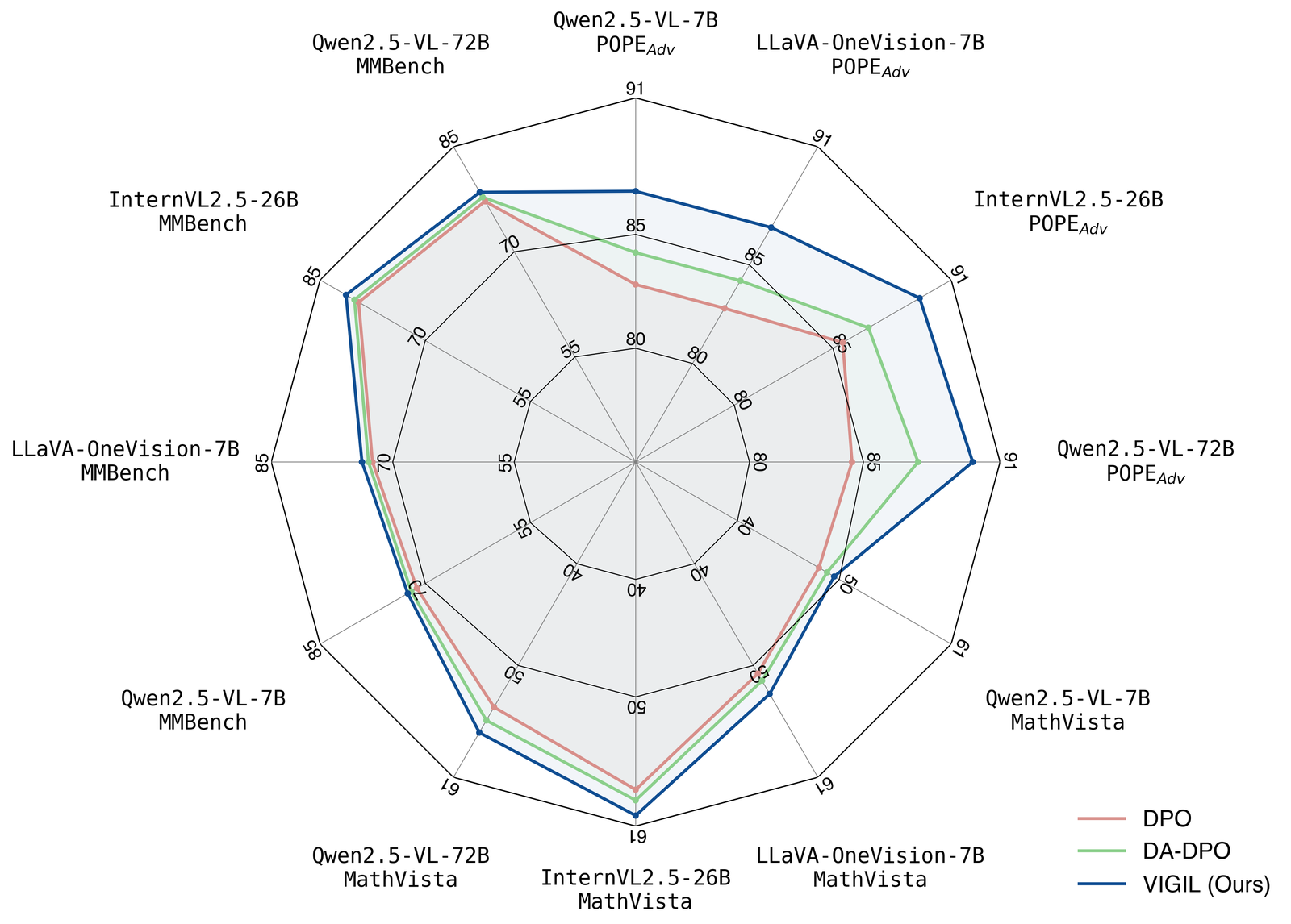
plot_comparison_radar.py gives Qwen2.5-VL-7B and LLaVA-OneVision-7B
byte-identical POPE triples — [82.8, 84.2, 86.9] in both — which is either a
coincidence to three digits across two backbones or a copy-paste. I lean
copy-paste and I cannot prove it. Same for figure_CellSpliceNet, which lists
eight methods and nine colours; the ninth is never drawn. Neither of those is
important. What is important is that committing the data next to the script is
what made either question askable at all.
What I would take
- The pattern, not the palette. Scripts, data and outputs in one folder, with the conventions written down beside them, is a better artefact than any of the individual figures. Eight papers' worth of plotting code that would otherwise be lost in eight private repos.
- The one rule they left out beats the thirteen they wrote down. A bar's length is its encoding. Everything else on the list is about how the figure looks; the axis floor is about what it says.
- Swap
red_2forviolet. It is already in the palette, it keeps all three semantic slots, and it goes from ΔE00 5.2 to 44.0 under the simulation. Or keep the reds and hatch them — the code to do it is already infigure_ophthal_review. - A style guide for agents needs a checker, not a spec. The
SKILL.mdrouting is right, the numbers indesign-theory.mdare right, and theapi.mdfunctions are prose that nine sessions will implement nine ways. Forty lines ofassertwould be worth more than all five reference files.
What would change my mind
7 claims above, and what would falsify each
The ImmunoStruct AUROC panel draws a 1.64x gap as 10.05x.
figure_ImmunoStruct/raw_data.pygives ImmunoStruct 0.882 and Prime-2.1 0.538;plot_bars.pysetsax.set_ylim([0.5, 0.9])on that subplot. Drawn heights are 0.382 and 0.038, so 10.05 against 1.64. If a later commit changes either the limit or the data this is stale. The weaker claim — that truncation exaggerates the weak baselines and compresses the strong ones — is arithmetic and does not depend on this particular figure: againstBigMHC_retrainedthe same panel draws 1.11x as 1.30x. What would change my mind on the framing, rather than the numbers, is a venue convention I am unaware of that reads a bar's baseline from the tick labels rather than its length.green_3 and red_2 fall from ΔE00 45.5 to 5.2 under deuteranopia, and blue does not.
Simulation is Viénot, Brettel & Mollon (1999) applied in linear light, scored with CIEDE2000 verified against five Sharma et al. (2005) reference pairs. The two colours come out
#BEBE8Dand#BDBD9F. A different dichromat model — Brettel's full two-plane construction, or Machado 2009's anomalous-trichromacy matrices at severity below 1.0 — will give different numbers, and Machado at severity 0.5 would give a much smaller collapse because most red-green CVD is anomalous rather than dichromatic. If the separation under a severity-weighted population model stays above ΔE00 15, "the worst choice for CVD" is too strong and the honest claim shrinks to "the worst choice for the ~2% of men who are dichromats". The independent check that would also have to fail is thedatavizvalidator's OKLab deutan ΔE of 2.3 on the same pair. The violet recommendation rides on the same method —#9A4D8Eagainst#8BCF8Bat ΔE00 44.0 simulated — so if the model is wrong, the recommendation is wrong with it.No file in the repository implements the nine functions specified in references/api.md.
grep -rn "apply_publication_style\|finalize_figure\|make_grouped_bar\|create_subplots\|PALETTE" --include=*.py .returns nothing across all 25 Python files at3c181f8;.gitignoreexcludes models,*.npy,*.csvand*.html, none of which would hide a module.tutorials.mdstates it directly. If a later commit addsscientific_figure_making/__init__.pywith those signatures, the criticism is gone and the skill becomes straightforwardly usable — that is the outcome I am arguing for.19 of 24 plotting scripts run on a bare numpy + matplotlib install; the other 5 need undeclared dependencies.
Container with Python 3.11, numpy 2.4.6, matplotlib 3.11.2,
latexandpdflatexpresent, nodvipng, nocm-super, no seaborn. Fourtext.usetexscripts fail intight_layoutwhen LaTeX cannot typeset a tick label;figure_ophthal_review/plot_composition.pyfails onimport seaborn. A machine with a full TeX Live and seaborn installed presumably runs 24 of 24, which is the author's. The claim is about what a clean clone reproduces, and a committedrequirements.txtplus a note aboutcm-superwould settle it.The committed figures were rendered in Helvetica and do not reproduce on a machine without it.
27
findfontwarnings for a two-element figure, then the fallback to DejaVu Sans. Re-runningplot_comparison.py,plot_bars.pyandplot_rewriting.pygives PNGs at the committed dimensions with 17.8%, 6.4% and 4.5% of pixels differing by more than 8/255, and a crop of the legend shows the same swatch colours in a different face. The radar comes out 3588×2588 against a committed 3560×2550, becausebbox_inches='tight'crops to text that is now wider. Install Helvetica and I expect all of this to go to near-zero; if it does not, something other than the font is non-deterministic and the claim is wrong.Accessibility is addressed nowhere in the repository.
grep -rni "colorblind\|color-blind\|accessib\|deuteran\|protan\|daltonism\|CVD\|cividis"over every.mdand.pyreturns nothing. The two grayscale-print sentences indesign-theory.mdandcommon-patterns.mdare the nearest thing and both mark the second channel optional. If the README's linked project pages or the papers themselves state a colour-vision rationale I have not read them, and this is about the repository only.Qwen2.5-VL-7B and LLaVA-OneVision-7B carry identical POPE triples in the radar's plotting data.
figure_VIGIL/plot_comparison_radar.pylists[82.8, 84.2, 86.9]for both. I have not checked either against the VIGIL paper, so it could be a genuine three-way tie to one decimal on two different backbones. If the paper's table shows different numbers, the plotting data has a copy-paste and the figure understates a difference; if it shows the same numbers, this is a coincidence and I have no finding. Either way the reason it is checkable is that the data is committed next to the script.
Read at ChenLiu-1996/figures4papers
commit 3c181f85e82c6f24948fcaaf3be6696102b41d8d, 76 tracked files, 24 plotting
scripts and one data module. Repository CC BY-NC 4.0; the three figures reproduced above are the
author's, under that licence, with the licence text and change notes committed
beside them in public/articles/figures4papers/. Underlying results belong to
their papers: ImmunoStruct
(Nature Machine Intelligence 2026,
code at KrishnaswamyLab/ImmunoStruct),
VIGIL (arXiv:2606.26387), Brainteaser
(arXiv:2505.10844), RNAGenScape
(arXiv:2510.24736) and LM-Dispersion
(arXiv:2602.00217). The compliance counts,
the colour-difference numbers and the reproduction run in this piece were all
computed locally from that commit; the colour-vision simulation is reimplemented
in components/articles/figures4papers/red-green-axis.tsx so you can check the
hex codes yourself.