Claude Dashboards and Claude Motion: two artifact templates, and what a hosted explainer changes for a pipeline like ours
mdjsonmcp2026-10-08 · 25 min · agents · video · generative-ui · code-generation · data-provenance · developer-tools
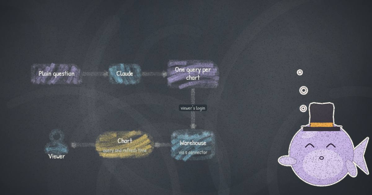
Why read this
Solidtop 85%What Dashboards and Motion are under the launch film, the link-sharing rule the announcement skips, and Motion set against a working film pipeline.
- Original analysis
- Widely used
- Concrete numbers to act on
Developer tools & infraAPI onlyProprietaryPractitioner tool
How this was scored
- Is it new?
- 1 of 3: An incremental tweak
- Can I trust it?
- 2 of 3: Measures key facts from files, code or configs
- Can I run it?
- 1 of 3: API-only, gated or restrictive licence
- Will I understand it?
- 2 of 3: Mechanism from first principles with figures
- Can I act on it?
- 2 of 3: A concrete recipe, numbers or comparison
- Will it last?
- 1 of 3: Relevant for months
- Does it affect many?
- 2 of 3: A widely used model, tool or lab release
- Only here?
- 2 of 3: A teardown or measurement few others did
Score 58 of 100, ranked 304 of 476 rated articles. Each question is answered 0–3 by hand, and a 3 is rare. How articles are scored
On 8 October @claudeai posted that "Claude Dashboards and Claude Motion are in beta today. Ask Claude to turn your data into live dashboards and your ideas into animated explainers." Two words in that sentence made me stop. "Live" is doing a lot of work for a chat product. And "animated explainers" is what this site already makes: every article here has an explainer storyboard, 124 of them are rendered as narrated films, and 372 math reels sit beside them. The site's films come out of a pipeline in this repository that Claude agents drive. Anthropic now sells a hosted button for the same job.
So I read everything that was published: the announcement, the four posts of the thread, the first page of 192 replies, the help-centre guides for Motion and Dashboards, the artifacts guide, the sharing rules and the admin guide. I also stepped through the 81.6-second launch film a second at a time. I could not use either feature. Motion is limited to Team and Enterprise plans, and nothing below comes from a hands-on run. Anthropic is also the vendor behind the agents that write this site, which is a reason to be more careful, not less.
What I expected was a video model and a BI product. What shipped is two templates on the artifact system Anthropic has been building since September, and once you see them that way most of the design follows.
Both are artifact templates
An artifact, in the help centre's words, is "anything Claude makes for you that you'd put in front of someone". Since 16 September an artifact made from a template is a hosted page with an owner, a share dialog, comments and an Export button. The page sits beside the conversation and can be edited by hand or by asking Claude. The Artifacts tab offers Docs, Slides, Design and Design systems as templates. Dashboards and Motion are the fifth and sixth.
That framing answers a lot before you read any feature list. Both inherit the artifact plumbing: the same share levels (Can view, Commenter, Can edit), the same rule that every viewer needs a Claude account, and the same admin switches under Organization settings > Artifacts. Both inherit the same prerequisite, "Cloud code execution and file creation", turned on under Capabilities, because an artifact is code that runs. Both also inherit the connector rules, and for a dashboard those turn out to matter most.
The help centre states each mechanism in a single line. "A dashboard is an artifact made from the Dashboards template. Claude writes a SQL query for each chart and runs it against your data source." And: "An animation is an artifact made from the Motion template. Claude builds it from your prompt as code that animates the text, charts, shapes, and images in it, and it plays like a short video."
Neither line mentions a new model. The model is whichever Claude you are talking to, and the launch screenshots show Opus 5.5 in one composer and Sonnet 5.5 in another. The template supplies the runtime around what Claude writes: a chart grid with query inspection for one, and a player with a timeline and an MP4 encoder for the other.
Dashboards: a page of queries, run as whoever is looking
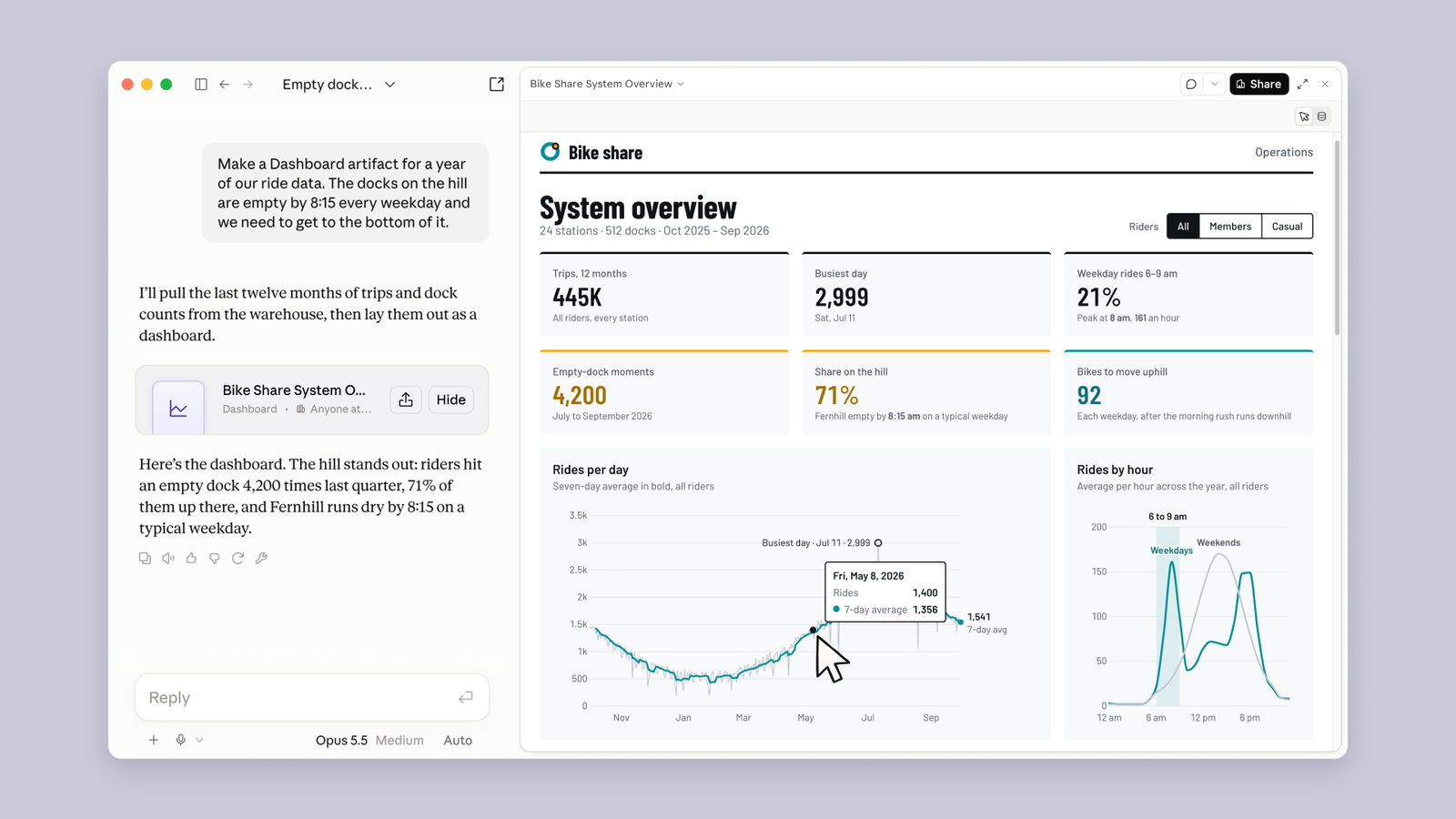
The example is a bike-share operator whose hilltop docks are empty by 8:15 every weekday. The prompt is the kind of thing a person types: "Make a Dashboard artifact for a year of our ride data. The docks on the hill are empty by 8:15 every weekday and we need to get to the bottom of it." Claude answers that it will "pull the last twelve months of trips and dock counts from the warehouse", and the artifact appears with six stat cards and two charts. The header reads 24 stations, 512 docks, Oct 2025 to Sep 2026.
Under the cards is a simple machine. You connect a warehouse first. The documented list is Amazon Redshift, BigQuery, ClickHouse, Databricks and Snowflake, and any app already connected to Claude, such as Salesforce, also works. Claude then writes one SQL query per chart, the template runs it through that connection, and the chart draws the result. Two things are always on the chart: the query ("Click any number to see the query behind it") and the time its data was last refreshed. The help centre's advice to "say what you want to know, not just what to chart" fits this design. The model's job is turning a question into queries; the template's job is showing you those queries so you can catch a wrong WHERE.
I like the query-on-every-chart rule more than anything else in the launch. Most chat-to-chart tools give you a confident number and a polite paragraph. A visible query lets you check whether "empty-dock moments" counts events or station-minutes, and the guide says outright to tell Claude when "it isn't counting what you meant".
What "live" means, and what it does not
The announcement says Claude "keeps it current as the data changes", and the thread says the dashboard "updates as your data changes". Nothing published says how. There is no refresh interval, no schedule, no mention of caching and no word on warehouse cost. What is documented is the per-chart "last refreshed" stamp and one sentence in the sharing guide that settles most of the question: "An artifact that pulls from connected apps uses the viewer's connections, not yours."
If the queries run on the viewer's own credentials, they have to run when the viewer opens the page. A snapshot taken on your credentials and shown to someone else would break the rule. So "live" most plausibly means the queries re-run against the warehouse when the page is opened, with the stamp telling you when that last happened. That is my inference from the sharing rule; Anthropic does not say it in those words. It also has a consequence the launch copy skips: two people looking at the same shared dashboard can see different numbers, if their warehouse roles see different rows. For row-level security that is the correct behaviour. For a meeting where everyone is meant to be looking at one number, it is a trap.
The same rule decides who can open a dashboard at all, and here the announcement and the help centre disagree. The announcement's sharing paragraph says "Share slides, designs, dashboards, and animations with people outside your organization, or with anyone who has the link, if your admin allows it." The sharing guide says, twice, "Artifacts that connect to your apps or use Claude can't use 'Anyone with the link.'" The admin guide repeats it under "What stays inside your organization". A dashboard reads a warehouse through a connector (the Dashboards guide sends you to "connecting your apps to Claude" to set one up), so as far as I can tell a dashboard can never get a public link, whatever the admin allows. Animations can. The announcement's sentence is true of the list taken together and false for its third item.
Sees the same charts, but the queries run on their connection, not yours. If their warehouse role sees different rows, the numbers can differ from what you saw.
source: Share artifacts: "Viewers use their own access"
The widget lays out the documented cases. Choose a dashboard and step through the viewers. A colleague with warehouse access sees the charts on their own connection. A colleague without it gets "an error instead of your data". An outside invitee can open the page, but "parts of the artifact that use Claude or your connectors don't work for them", and on a dashboard those parts are the charts. A link for anyone is not offered at all. An animation is different, because once it is built it holds its numbers as code and needs no warehouse to play. That last point is my reading; nothing documents a connector inside a Motion artifact.
The rest of the Dashboards spec sheet
Plans: the X thread says "paid plans", and the help centre spells that out as Pro, Max, Team and Enterprise. On Enterprise it is off until an owner turns it on. Its intended scope is narrow, and to Anthropic's credit it says so: dashboards "work well for quick, exploratory questions, like how this week's signups compare with last month's". For anything heavier you are meant to "send the dashboard from Claude straight to" Amplitude, Grafana, Hex, Mixpanel, Omni, Perplexity, PostHog or Sigma, with Looker, monday.com and Tableau listed as coming soon. Nothing says what gets sent: the SQL, the data, or a link. So Dashboards sits upstream of BI tools rather than replacing them, which is a more honest pitch than several of the replies ("ClaudeBI") gave it.
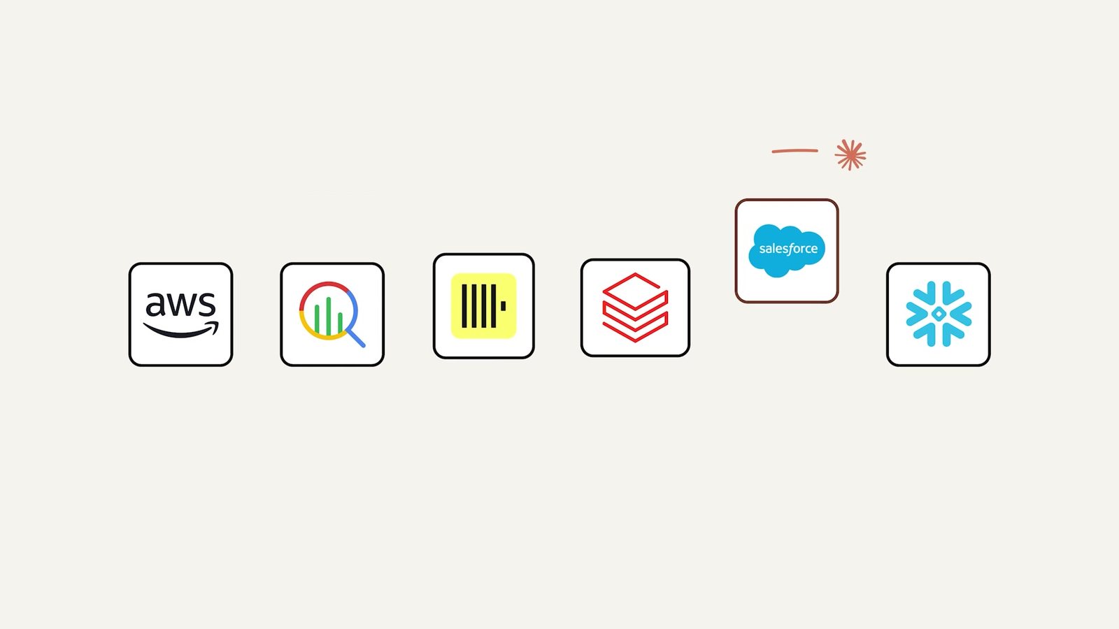
The limits that are written down sit in the artifact pages rather than the Dashboards guide. Connector tools "that need approval for each action aren't available to artifacts". An owner can switch artifact connectors off for the whole organisation, but "can't limit which apps artifacts can reach". On HIPAA-ready organisations the templates can be turned on, but "these aren't covered under your Business Associate Agreement". Usage comes out of the normal plan limits, and on usage-based Enterprise plans it is billed "at standard API rates". The query cost lands on your warehouse bill, which no page mentions.
I checked the example against itself, since a demo dashboard is the one place where an invented number would cost nothing. The dates hold: 11 July 2026, labelled "Sat, Jul 11" as the busiest day, is a Saturday, and the tooltip's "Fri, May 8, 2026" is a Friday. I also traced the teal seven-day-average line out of the hero image, pixel column by pixel column, against the chart's own axis. Its daily mean comes to about 1,100 rides, roughly 400,000 over the year, against the "445K" card. The summer stretch is hidden under the tooltip and I bridged it with a straight line, so this is a reading of a screenshot, not an audit. Within that error the card and the chart agree. I take nothing from this about the product. It does say that whoever built the demo made the numbers consistent, which not every launch does.
Motion: code that plays like a video
Motion's one-line mechanism has a negative in it, and the negative is the important part: "It doesn't use a video generation model, so there's no generated footage and no AI-generated people." Claude writes code, and the template plays it. The thread says the same thing more bluntly: "Claude writes each one as code, with no video model involved, so you can change any word, number, or timing, then export an MP4."
That is the same bet this site made. A film whose frames come from code is a program over time: frame is some function of , and the encoder samples it. The math reels' engine says so in a line: "a frame is a pure function of t". Everything Anthropic advertises follows from that bet. Editing a word is a text edit, not a re-roll of a diffusion sample. A number on screen is a literal in the source, so changing it changes only it. There are no hands with six fingers because nothing is sampled from pixels. The help centre's version: "Because each animation is code, you can change one detail, like a word, a number, or the timing, and the rest stays as it was."
What the code is written in, nobody says. It could be DOM and CSS, Canvas, WebGL or one of the open frameworks; the launch example contains a 3D city, so whatever it is draws 3D. Whether you can see or download the source is not documented either. The help centre offers "Adjust the animation yourself in the editor", but not what the editor edits.
The launch example, step by step
The launch film's second half shows a Motion artifact being made from the bike-share dashboard, and it is the only detailed evidence there is. Here it is in order.
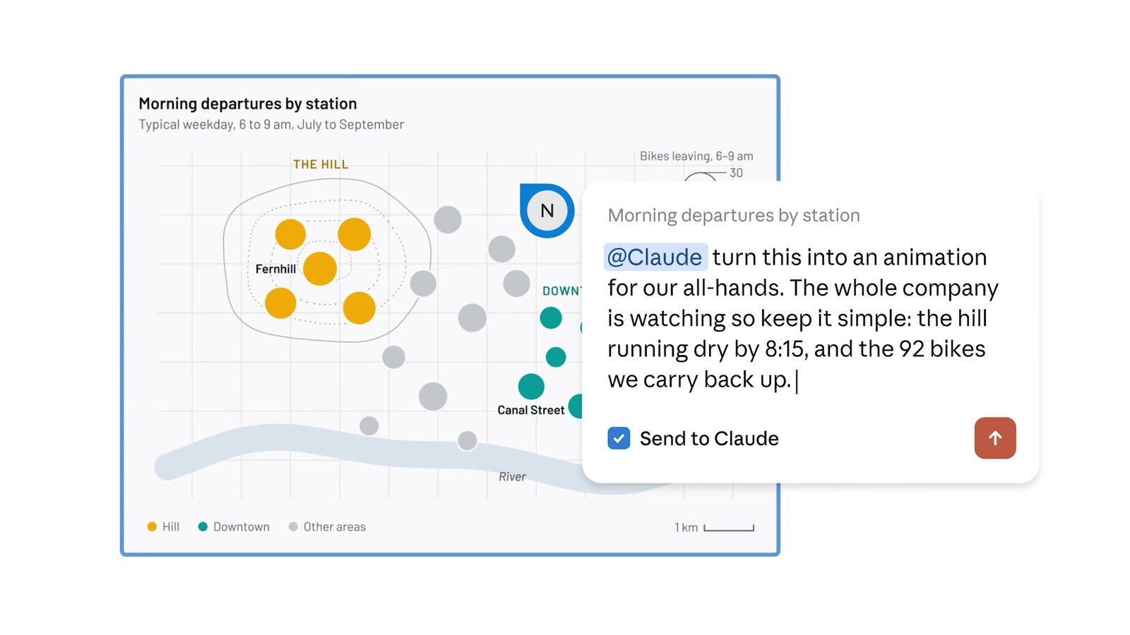
The request is not typed into the chat. It is a comment pinned to the dashboard's "Morning departures by station" map: "@Claude turn this into an animation for our all-hands. The whole company is watching so keep it simple: the hill running dry by 8:15, and the 92 bikes we carry back up." A "Send to Claude" box is ticked. Comments on an artifact can be routed to the model, and the comment's anchor tells it which chart is meant. That is the most interesting interaction in the launch, and it belongs to the artifact system rather than to Motion.
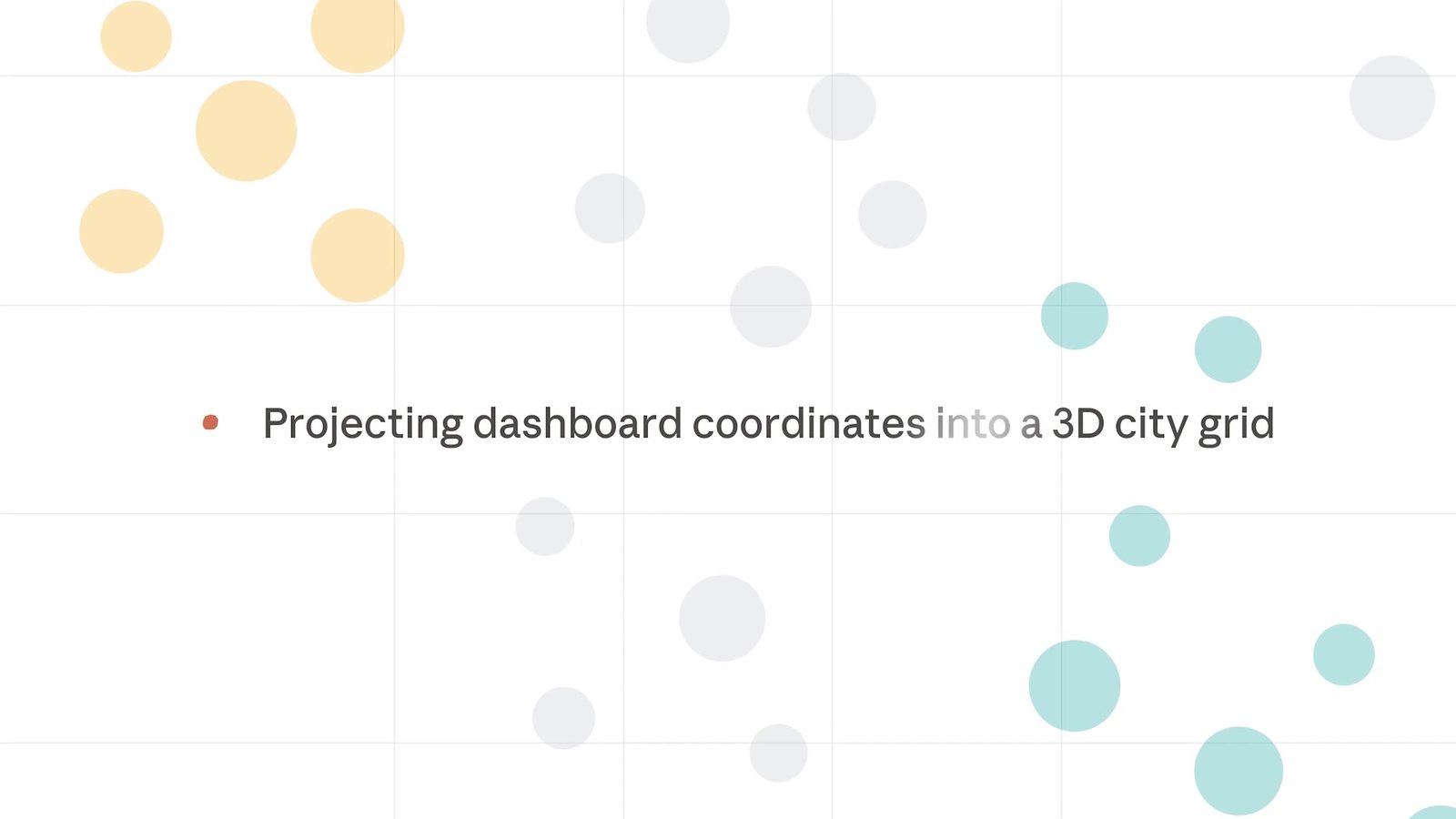
Claude replies, "I'll build it from the dashboard's own station map, so the room sees the chart they know come to life." The film then shows a progress line, "Projecting dashboard coordinates into a 3D city grid", over the map's dots. This frame is the film's styling, so I would not read it as a screenshot of the product, but the content matches the result. The animation reuses the dashboard's data, the station positions and the counts, rather than inventing a scene.
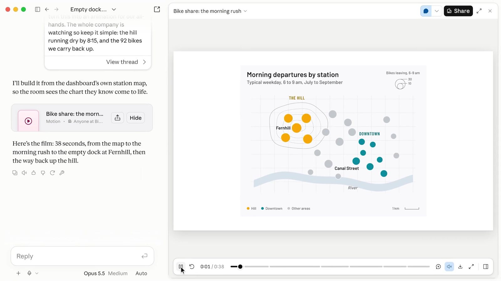
The answer is "Here's the film: 38 seconds, from the map to the morning rush to the empty dock at Fernhill, then the way back up the hill." The player tells you a little about the format. The time reads 0:01 / 0:38. The scrubber is broken into segments, which reads as a scene list. The bar holds a comment button, a mute toggle, download and full screen. The mute toggle is the only hint of sound anywhere in the sources, and I would not build on it. No page mentions a voice, music or captions.
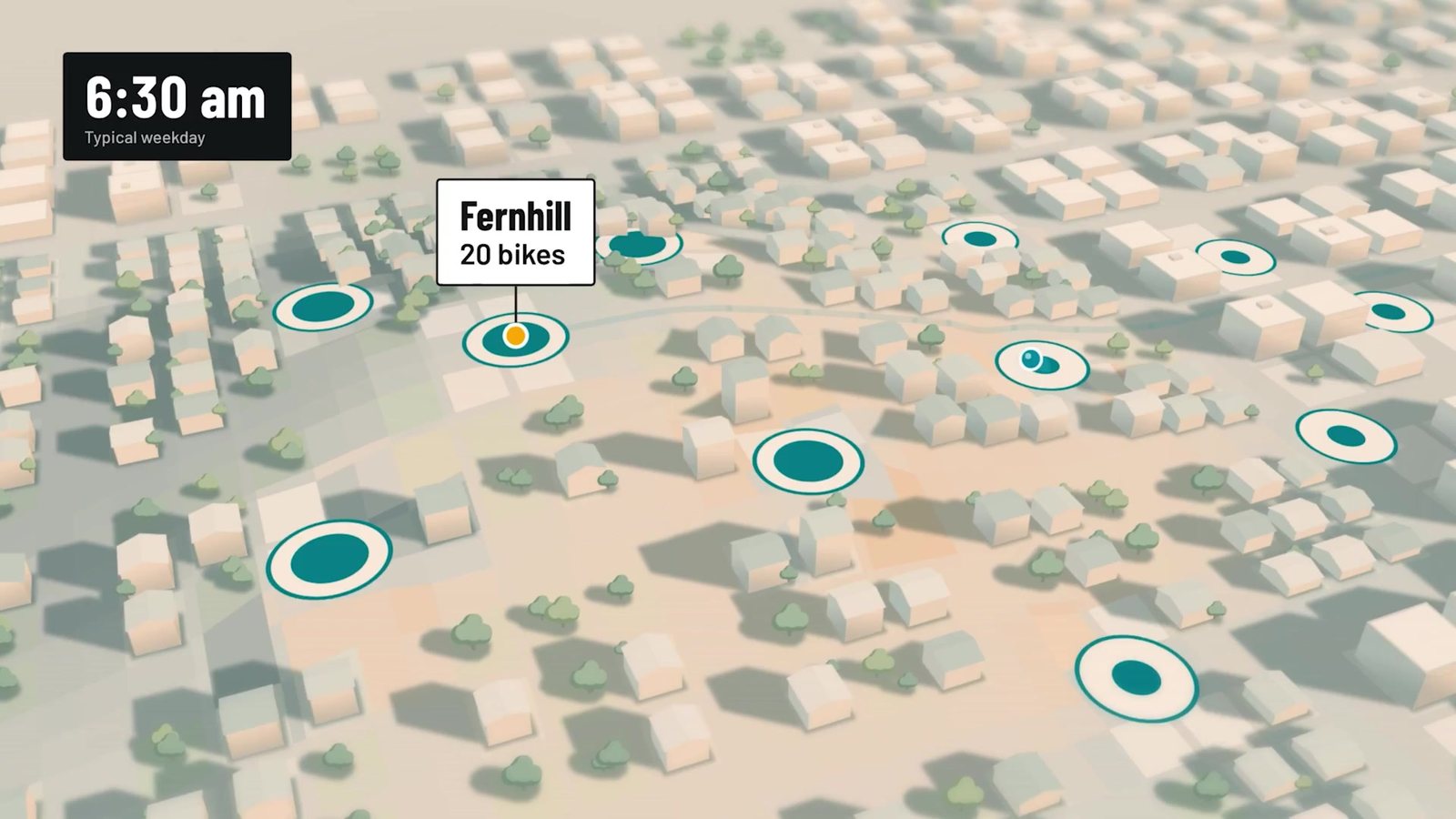
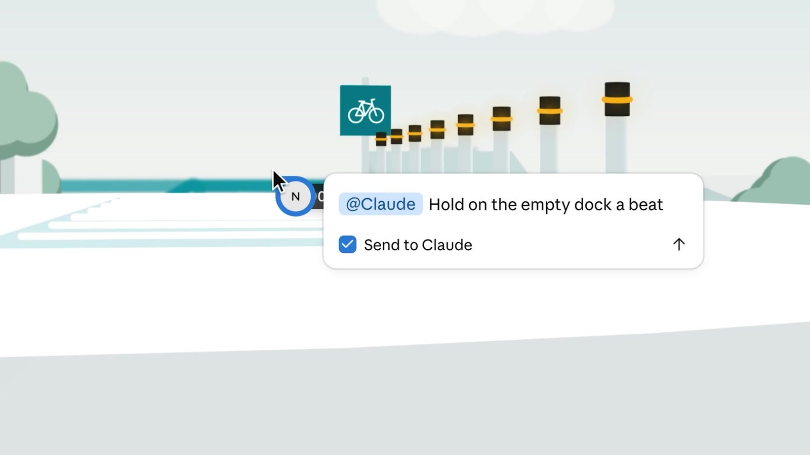
Then the edit. Someone pauses on the empty dock and pins a comment to that moment: "@Claude Hold on the empty dock a beat longer so it lands." The chat shows "Comment on 'Bike share: the morning rush' sent to Claude", then "Thinking", then "Updating artifact 5s". The all-comments panel shows the other reviewers' notes: Sam's "Can we name the van route here? Ops will ask." and Dev's "Love the 4,200. Put it on the all-hands title slide too." The film ends on an Export button with the partner logos around it: Adobe, Descript, HeyGen, Higgsfield, invideo, Luma AI and Runway, with Canva and Captions coming soon.
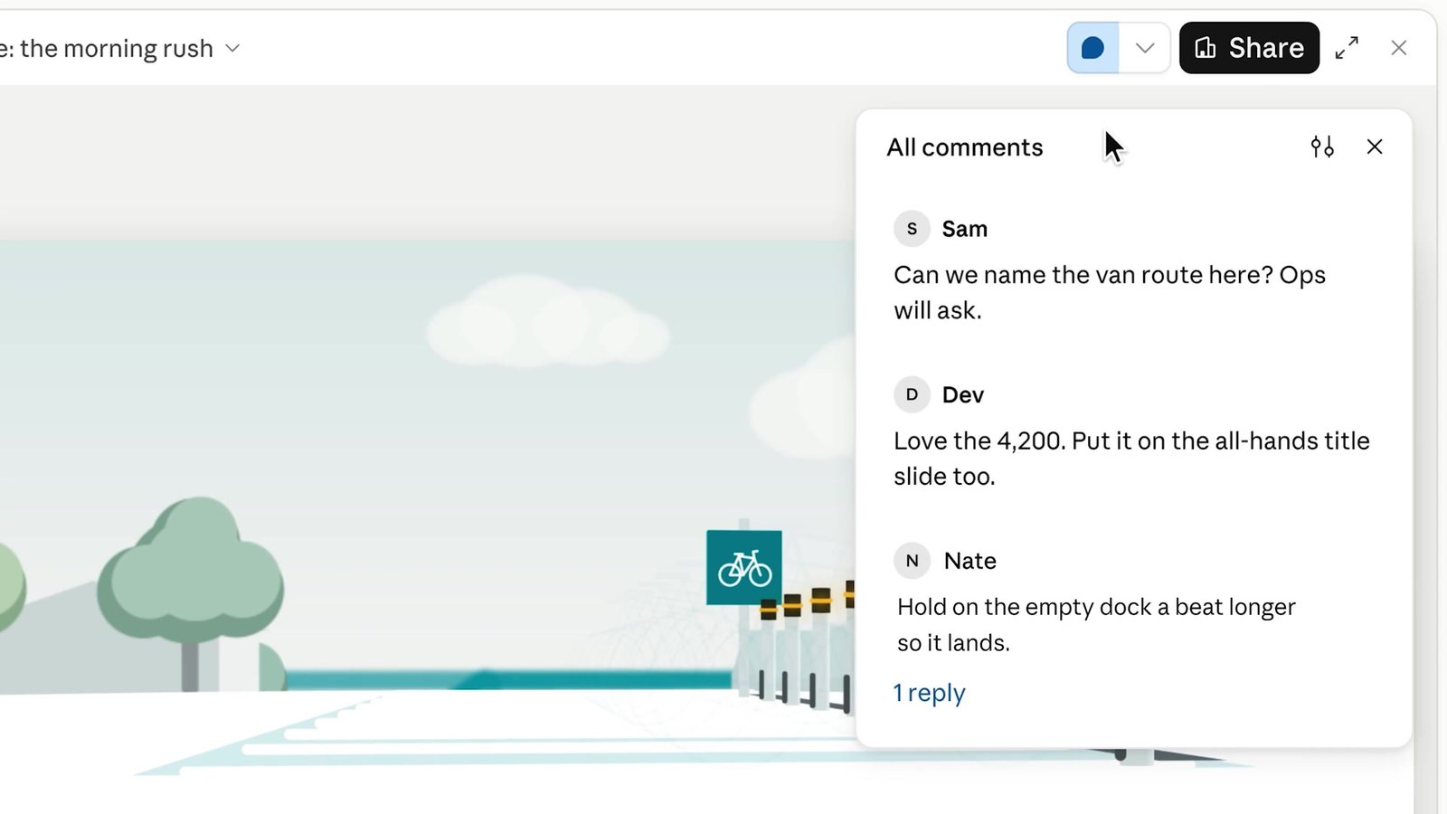
Strip the polish off and the loop is: a request anchored to an object, code written by the model, a player that turns the code into time, comments anchored to moments, and an edit that changes only what the comment asked for. A reply asked whether this was "just a 5 minute video of charts moving". The film says 0:38, and the help centre's own examples are a "30-second explainer" and short walkthroughs. That is short-form by design.
The Motion spec sheet, such as it is
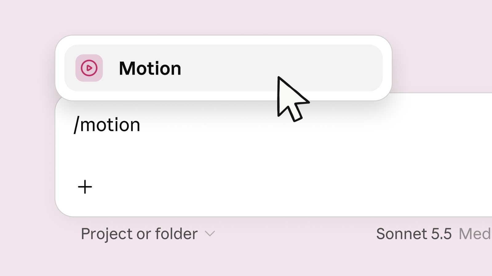
The documented part is short. Motion is in beta on Team and Enterprise only, on by default for Team and off by default for Enterprise. It starts from a chat, from the Output menu, from /motion, or from a template in the Artifacts tab. It exports MP4 through Export. It counts toward plan usage limits, and "Longer or more complex animations use more of your limit than a typical message." Your own guidance to it is three things: who will watch, where it will play, and "roughly how long it should be". You are also told to attach your own material "so the animation is built from your own content".
The undocumented part is longer: maximum length, resolution, frame rate, audio of any kind, captions, whether the source code is visible or exportable, and whether the design systems that style decks and designs also style animations. Nor is there any statement on what reaches the partner tools. "Open it in Adobe" could mean an MP4 handed over or a project file, and those are very different things to an editor.
The comparison I actually care about
This site's explainer films are made by a pipeline you can read in brand-crew/skills/explainer-films/. An agent writes a storyboard, data/films/<slug>.json, and that storyboard is data, not code. Its SKILL.md says it in one line (line 29): "You write a storyboard (JSON); the engine owns the look". The storyboard picks from 15 scene types (title, idea, diagram, stack, steps, compare, grid, equation, figure, stat, bars, tally, quote, takeaway, end) and fills in their fields. A fixed engine of about 3,800 lines of JavaScript paints every frame in headless Chromium, in one of eighteen drawn styles. Kokoro-82M voices each line on a CPU, audio.py lays in the voice, effects and score, and ffmpeg writes an H.264 file, a WebVTT caption track and a poster. Of the 124 films rendered so far, 117 are 1280x720, the average runs 108 seconds and the average file is 3.1 MB. Every one has a voice.
The difference in who writes code turns out to be the whole comparison.
Motion lets the model write the animation. That is why one prompt can turn a 2D station map into a 3D city with a clock running through the morning, which our engine cannot do at all. A storyboard here can ask for a diagram that builds node by node, or a grid whose cells light by pattern, and nothing else. When an article needs a picture outside the fifteen types, the answer is a hand-built component in the article, not the film. Motion's expressiveness is real, and the launch film shows it.
What our design buys with that restriction is the ability to check. Because a storyboard is data with a schema, scripts/check-films.mts can read it against the article. Every digit a viewer sees or hears has to appear in the article's MDX, or the build fails (lines 15-18). Quotes have to be a contiguous run of the article's own words (line 362). Narration is capped at 280 words (line 233), and diagram nodes may not overlap or point their arrows backwards. A film is stamped with a hash of its storyboard, the article's date and the engine, so editing the article marks the film stale and build.mjs --stale re-renders it. The checker is honest about its limits: "It cannot tell whether an explanation is right." It can tell whether a number was made up, and no prompt on its own gives you that.
Motion's headline feature, "change any word, number, or timing", is the reverse of that rule. It is great for an editor and dangerous for a fact. In the launch example the chain is in good shape at the dashboard: the 4,200 on the card has a query behind it. Then the animation takes the 4,200, the 92 and the 8:15, and nothing published says the animation keeps a link back to those queries. Dev's comment asks for the 4,200 on a title slide too. If the warehouse changes next week, the dashboard refreshes. The animation does not, because it is code with the number written into it, and once it is exported as MP4 there is nothing left to link. Anthropic is right to say Motion is "built for explaining your own work". The integrity of the numbers is still your job, and the product does not, on the evidence, help with it.
Review is where Motion is plainly ahead of us. Its review loop is a comment pinned to a moment, "@Claude Hold on the empty dock a beat longer", and a five-second targeted update. Ours is a pull request over a JSON file, plus a contact sheet the author is told to look at before rendering. JSON in a diff is very reviewable for an engineer. It is useless to the person who actually knows the dock should hold a beat longer. A film edit here also re-renders the whole film, while Motion's edits are local by construction.
Sound goes the other way. Every film here is narrated, captioned and scored, and the narration pipeline does real work: per-line timing, a pronunciation table, captions drawn from the same lines. Nothing in Motion's documentation mentions a voice. If an animation for an all-hands plays silently behind a presenter, that is fine. For an explainer someone watches alone, the narration carries half the explanation, and for now Motion leaves you to add it in Descript.
Scale and cost diverge too. This repository has more than 460 storyboards, and they are regenerated whenever the engine or an article changes. That job runs on CPUs we own. Motion has no documented API or batch path, artifacts "aren't available through third-party cloud platforms", and every animation draws on someone's plan limit. It is a tool for a person making one film, which is what it says it is.
| need | Motion | our films | |
|---|---|---|---|
| Free-form visuals: a 3D city, a custom layout, anything code can draw | |||
| Built straight from company data that lives in a warehouse | |||
| Teammates comment on a moment in the film and Claude acts on it | |||
| Change one word, number or timing and leave the rest alone | |||
| Finish it in a video editor | |||
| Narration and captions in the deliverable | |||
| Every number on screen is checked against a source text | |||
| One house look across every film | |||
| Hundreds of films, re-rendered when their source changes | |||
| Runs on my own machine, outside any plan's usage limit | |||
| Available to someone on a Pro or Max plan |
Everything you picked is documented for Motion, and the pipeline misses some of it. Motion fits.
The widget sets out those trade-offs with nothing in it that the sources do not say. Each row is a need. Each mark is "does", "does not" or "not documented", and tapping one shows the sentence it rests on. The three presets are the jobs I would actually weigh. For the all-hands chart drawn from warehouse data, Motion covers every need picked and our pipeline covers none of them. For a published explainer for this site, it flips: the pipeline covers everything picked and Motion's column is mostly question marks. The onboarding walkthrough splits, with Motion stronger on visuals and edits and nothing documented about the voice it would need.
What I would take from it
The comment-to-Claude loop is the thing worth copying. Pinning a note to a frame and having the agent edit only that moment is a better review interface than either a diff or a chat message, because the anchor carries the context that a chat message has to spell out. For a pipeline like ours the cheap version is clear: a storyboard scene and a time within it already identify a moment, and an issue that names scene 4, 0:12 is something an agent can act on.
The "no video model" line is the right call, and it is worth saying why. Explainer animation is mostly text, numbers, arrows and layout. Code draws those exactly, and a diffusion sampler draws them approximately. Anthropic chose determinism and editability over photorealism, which is the choice every serious explainer pipeline I have read, including ours and the one-shot launch videos and Claude-made product demos covered here, has made independently.
The sharing story needs one correction from Anthropic's own help centre: dashboards cannot be shared by public link, whatever the announcement's sentence suggests. Viewers run the queries on their own credentials, so people looking at the same dashboard can see different numbers. Plan for both before the first board meeting.
And "live" belongs to Dashboards, not Motion. A dashboard re-runs its queries. An animation is a snapshot of the numbers that were true when Claude wrote the code, and an MP4 is a snapshot of that. If I used Motion for anything with figures in it, I would keep the dashboard link next to the video and treat the video as dated, the way a slide deck is.
The same release took Docs, Slides and Design out of beta on every plan, including Free. Since they arrived in every conversation, people have made "more than 45 million docs, decks, and designs", by Anthropic's count. The standalone claude.ai/design closes on 14 December, and its design systems migrate into artifacts. The direction is clear: the artifact is becoming Claude's unit of output, and each new template is a narrower runtime around code the model writes. Of the two new ones, Dashboards is the more consequential, because it puts a model between people and the warehouse with the query on show. Motion is the more fun, and the one whose limits I would test first.
For the wider pattern of a model emitting structure that a fixed renderer draws, see generative UI in two model calls, and for the math-reel engine mentioned above, the openai/math release.
How I checked
Sources, all read on 8 October 2026: the X post and its thread through the fxtwitter mirror (/2/thread and /2/conversation for post 2108271552991252810), including the first page of replies; the announcement at claude.com; the help-centre pages "Get started with Claude Motion" (17454997), "Get started with Claude Dashboards" (17454700), "What are artifacts and how do I use them" (17153992), "Share artifacts" (9547008), "Artifacts admin guide for Team and Enterprise plans" (16994751), "Available beta and research preview features" (14503520) and "Migrate from standalone Claude Design" (17440474). The quotes above are copied from those pages as served that day, and help-centre pages change, so check them again before relying on a rule.
Images: the two 1920x1080 images embedded in the announcement (the same files the thread attaches), and stills cut with ffmpeg from the 1920x1080, 81.6-second launch film attached to the post, at the timestamps given in each caption. I flattened them onto white and scaled them to 1600 px wide. Times in the captions are positions in that film, not in the product.
The chart check: I took the teal seven-day-average line from the hero image column by column (318 of 485 columns had a readable line; the rest, mostly under the tooltip, are linearly interpolated), mapped pixel height to rides from the chart's own axis ticks (500 rides per 36 px), and averaged. The weekday checks are plain calendar arithmetic.
Our pipeline: the film counts, sizes, resolutions and durations come from data/.generated/films.json in this repository (124 films); the storyboard count is the number of files in data/films/; the line numbers are in brand-crew/skills/explainer-films/SKILL.md and scripts/check-films.mts at the commit this article was written on.
What I could not check: anything about Motion or Dashboards in use. I could not see output resolution, length limits, audio, refresh cadence, warehouse cost or what reaches the partner tools, because none of it is published and I had no Team or Enterprise seat to try it on. Where the article says "as far as I can tell" or "my reading", that is why.